Current category or tag: Content Design

German Embassy

German Embassy

Logo Design

KhombiSA

Slogan Co-creation & Logo Design

Client Challenge: To co-create a slogan and icon for the German Embassy’s Combi with an unexpected South African approach that doesn’t isolate the youth but instead intrigues them. The German Information Centre revamped an ‘old school’ VW bus which travels to different parts of South Africa to promote the German language, culture and values in a fun, friendly, modern and interesting way. The bus has a cool, funky, design inspired by the colours of the German flag (red, black and yellow). It has a sitting area in the bus to enable small scale discussions as well as speakers and a sound system in the interior. The team were looking for a logo and a slogan/catch phrase that will fit the character and feel of the bus and make people curious about finding out more about the bus.

Our Solution: After exploring different name ideas for the combi project, the client settled on Khombisa, from the isiZulu word show, which perfectly allowed us to play with the concepts of Khombi- representing the iconic and much-loved German vehicle, and -SA for South Africa.

  • Illustration
  • Logo design
  • Emblem

Dave’s approach

Keeping the youthful audience in mind that the client wanted to appeal to, I wanted to bring the three strong colours of the German flag out into a current line-drawn icon and font to catch their attention as the combi moved around locations. I wrapped the combi in the colours of the flag giving it a modern retro twist – and I coloured in the SA part of the bold typography in green to bring through the rooted South African location of the project and to play on the double entendre of KhombiSA. It was a fun project to be a part of.

Khombisa at the German Beer fest

SoulProviders Collective/Hollardays

SoulProviders Collective/Hollardays

Illustration / Content Design

SoulProviders Collective/Hollard


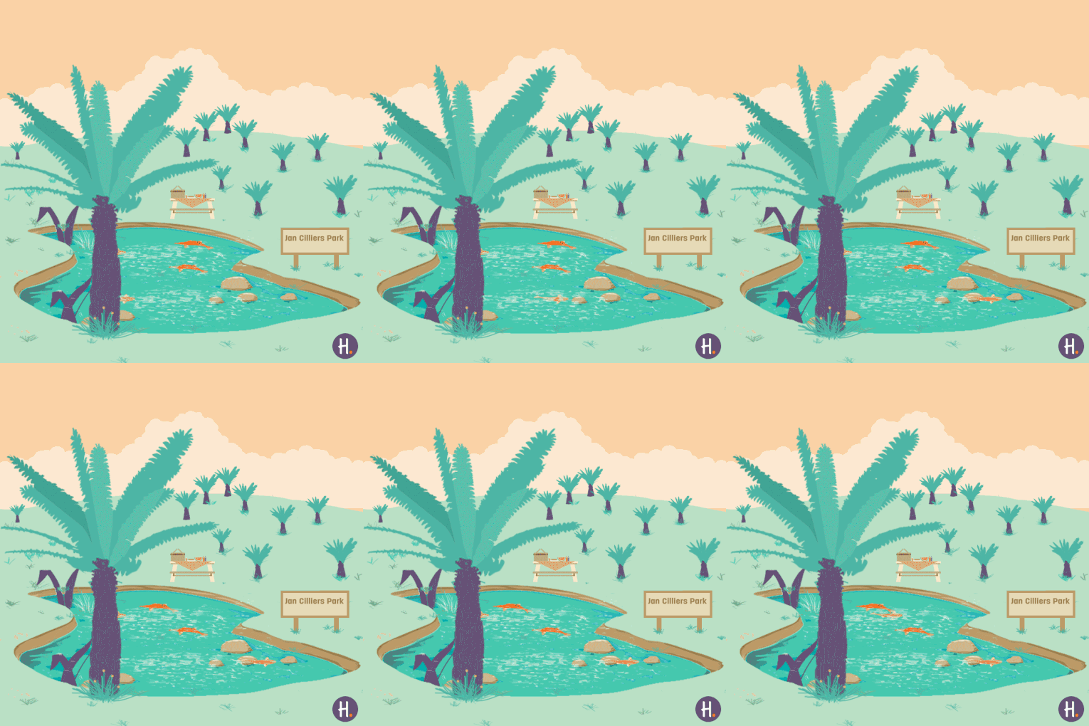
Client Challenge: We were tasked with illustrating content for Hollard’s Hollardays campaign.

Our Solution: We created the proposal based on the the style/mood of the festive season, while incorporating a fresh and futuristic approach on all visuals.

  • Illustration
  • Presentation Design
  • Layout

Dave’s approach

We wanted to bring out iconic elements from each place that we were bringing to life, that would at once tell a story about a destination or experience but also give it a unique moment in the series.

PowerFM #987Woman

PowerFM #987Woman

Social Media Content Design

Women’s Month

Social Media Content

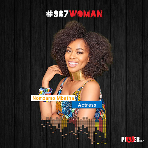
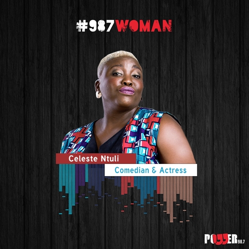
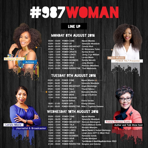
Client Challenge: We’ve had a special place in our hearts for PowerFM 987, our ECD and co-Founder SJ Boden was one of the first studio guests on Tim Modise’s inaugural show on day one of the official on-air broadcast and our superstar co-Founder and Chief Illustrator David Tshabalala has been interviewed on air about his craft too. So it was with gusto and delight that we were asked to produce some social media content for the station to laud Women’s Month in SA under the hashtag #987Women in 2016.

khanyi Dlomo Womens month powerfm suketchi social media content design

Our Solution: Power FM invited female guest speakers to be a part of their radio station for Women’s Month and we were tasked with creating the content campaign for it.

We used a simple, bold design that stood out from the dark charcoal background. We edited part of the photography to add a radio element.

  • Social Media Content Design
  • Web Banner
  • Graphic Design
  • Content Design

We love working with media organisations especially when they’re celebrating Women’s Month of August in South Africa.

Crisis Action

Crisis Action

Annual Report Design

2017 Annual Report

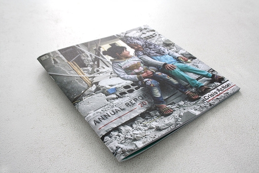
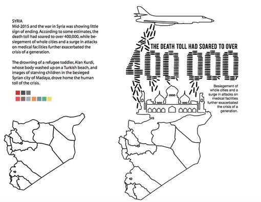
Client Challenge: Crisis Action is a non-profit organisation that aims to protect civilians from armed conflict. The team approached us to create their 2017 annual report to shed light on their work, using our distinct visual approach, while respecting the sensitive subject matter.

Suketchi-Branding-and-Design-Crisis-Action-06

Suketchi-Branding-and-Design-Crisis-Action-06

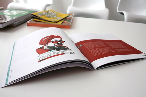
Double page spread from the 2017 Annual Report

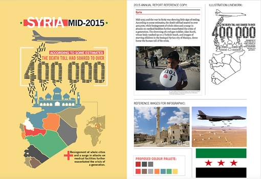
Our Solution: In order to fulfill the requirements of the brief, we identified three main visual directions to effectively communicate Crisis Action’s work:

  • Photography
  • Illustration
  • Data Visualisation

Quotation from David:

We benchmarked our approach against other annual reports and noticed that for ours to be unique, we needed to seamlessly integrate crafted graphs, iconography and illustrations to sit nicely and juxtapose with the existing emotive photography.