Current category or tag: Branding

Crisis Action/SAWA

Crisis Action/SAWA

Logo & Content Design

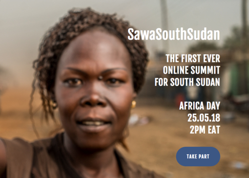
Crisis Action – SAWA South Sudan


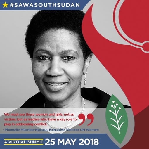
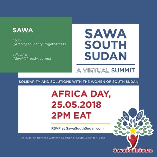
Client Challenge: We were tasked with creating a logo for the SAWA virtual summit that took place on Africa Day.

Our Solution: Inspired by a tree that provides shelter from the sun, we created a logo that emphasises communication and a community that comes together to engage in dialogue.

  • Logo Design
  • Content Design

Dave’s approach

I created a human figure that also serves as the trunk of the tree, this emphasizes how proper human interaction serves as the backbone for building communities and growth.
Thinkworks/Fuseworks

Thinkworks/Fuseworks

Logo Designs

Logo Design

Client Challenge: We were tasked with the branding of ThinkWorks and FuseWorks, two separate but connected entities that required a co-branding approach. We needed to design a logo which captures the essence of the businesses – lateral and strategic thinking and solutions and then interpret it into email signatures.

fuseworks email signature logo design suketchi

Our Solution: Our client wanted the logo to visually represent “thinking outside the box” (for ThinkWorks) and tech solutions for strategic thinking (for FuseWorks). Both brands have a clean typographic logo with an asterisk – an asterisk represents a ‘wild card’ in coding, as directed by the client.

  • Logo Design
  • Branding
  • Graphic Design
  • Email Signature Design

Meghaa’s approach

Since the two brands are related, the flat colour palette enables us to easily show their connection, along with a flat illustration style that compliments and affirms the brand association. The client knew what he wanted, and gave me clear instructions which I was able to interpret into a polished final co-created product.

Daily Maverick

Daily Maverick

Apparel Design – Hoodie branding

Daily Maverick

Apparel Design

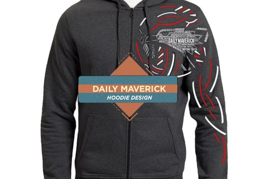
Client Challenge: Daily Maverick is a popular daily online newspaper, we were approached by Styli Charalambous, the founder, who needed us to create an iconic illustration on hoodies for the staff.

Our Solution: Because words are so important in journalism, we created an illustration that is composed of word clouds. The words that make up the final image are things that embody the Daily Maverick brand.

  • Illustration
  • Graphic Design
  • Apparel Design

Dave’s approach

I focused on words that best describe Daily Maverick based on our research, and used these to build an image of the eagle.

Danone – Mayo

Danone – Mayo

Africa Expansion: Point of Sale

Africa Expansion/Danone
Mayo


Client Challenge: Africa Expansion/Danone is a global food company holding top positions in healthy food through its four businesses Fresh Dairy Products, Early Life Nutrition, Waters, and Medical Nutrition. The company approached Suketchi to assist with branding and to bring one of their products Mayo to life by designing elements for point of sale.

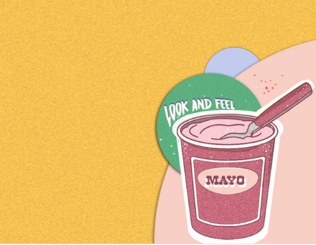
Our Solution: To illustrate how tasty Mayo is, we developed a character that is enjoying the yoghurt snack with the emphasis on her licking the spoon.

  • Illustration
  • POS Design

Dave’s approach

I created a character that is synonymous with the target market. She’s cool and hip and enjoying the product

German Embassy

German Embassy

Logo Design

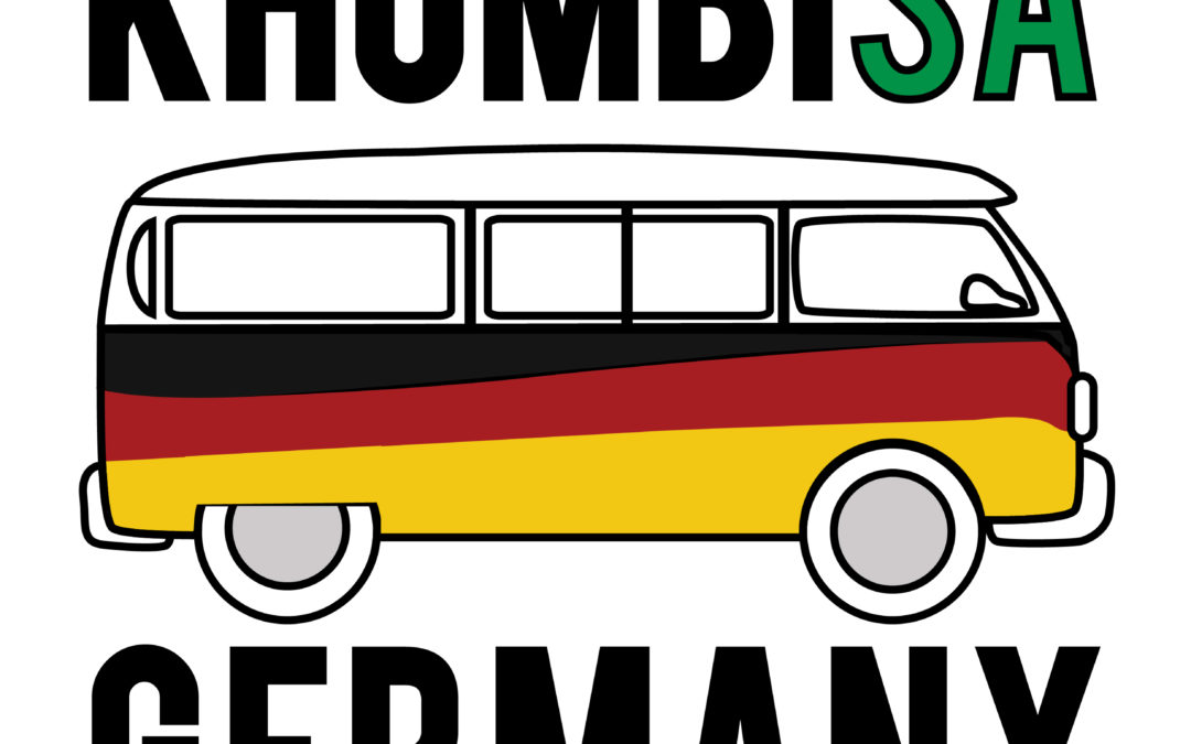
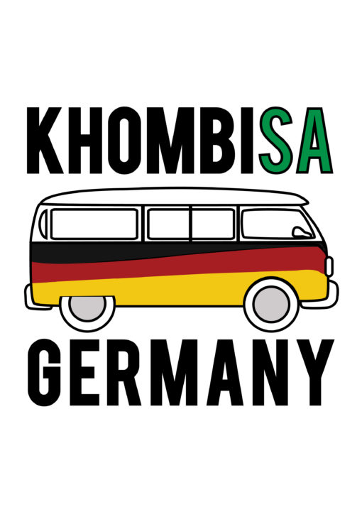
KhombiSA

Slogan Co-creation & Logo Design

Client Challenge: To co-create a slogan and icon for the German Embassy’s Combi with an unexpected South African approach that doesn’t isolate the youth but instead intrigues them. The German Information Centre revamped an ‘old school’ VW bus which travels to different parts of South Africa to promote the German language, culture and values in a fun, friendly, modern and interesting way. The bus has a cool, funky, design inspired by the colours of the German flag (red, black and yellow). It has a sitting area in the bus to enable small scale discussions as well as speakers and a sound system in the interior. The team were looking for a logo and a slogan/catch phrase that will fit the character and feel of the bus and make people curious about finding out more about the bus.

Our Solution: After exploring different name ideas for the combi project, the client settled on Khombisa, from the isiZulu word show, which perfectly allowed us to play with the concepts of Khombi- representing the iconic and much-loved German vehicle, and -SA for South Africa.

  • Illustration
  • Logo design
  • Emblem

Dave’s approach

Keeping the youthful audience in mind that the client wanted to appeal to, I wanted to bring the three strong colours of the German flag out into a current line-drawn icon and font to catch their attention as the combi moved around locations. I wrapped the combi in the colours of the flag giving it a modern retro twist – and I coloured in the SA part of the bold typography in green to bring through the rooted South African location of the project and to play on the double entendre of KhombiSA. It was a fun project to be a part of.

Khombisa at the German Beer fest