Africa Expansion: Point of Sale
Jun 9, 2018 | |
Africa Expansion/Danone
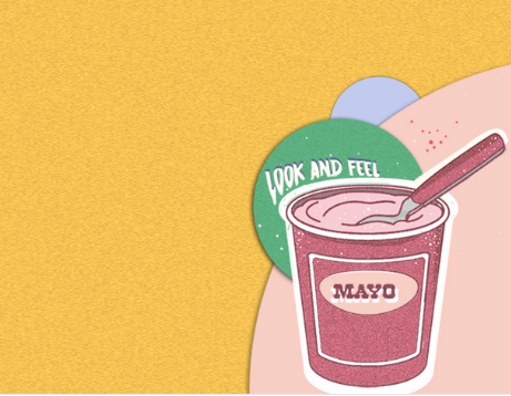
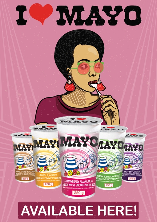
Mayo
Client Challenge: Africa Expansion/Danone is a global food company holding top positions in healthy food through its four businesses Fresh Dairy Products, Early Life Nutrition, Waters, and Medical Nutrition. The company approached Suketchi to assist with branding and to bring one of their products Mayo to life by designing elements for point of sale.
Our Solution: To illustrate how tasty Mayo is, we developed a character that is enjoying the yoghurt snack with the emphasis on her licking the spoon.
Dave’s approach
I created a character that is synonymous with the target market. She’s cool and hip and enjoying the product
Illustration Digital Single Cover
Jun 9, 2018 | |
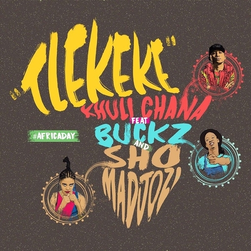
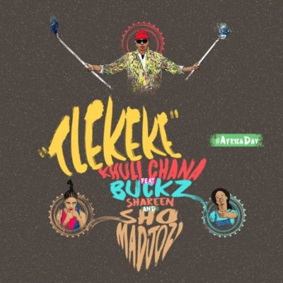
Khuli Chana
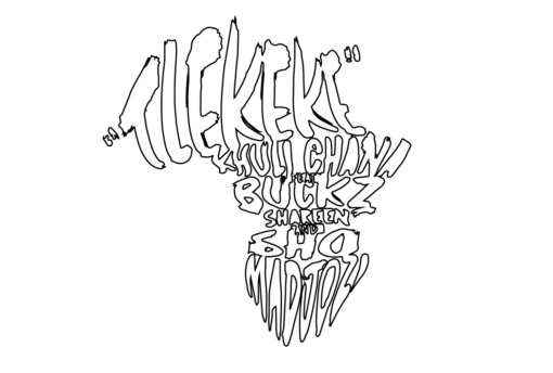
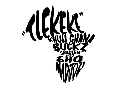
Tlekeke Cover Design
Client Challenge: Motswako rapper Khuli Chana, had a single release on Africa Day and asked us to design artwork for the single called “Tlekeke” with a very short time to turn it around. We brought it, for a fierce Motswako Originator who we are proud to call our friend and client.
Our Solution: Inspired by the African continent, we created artwork that included the featured artists on the single. It was released on Africa Day. We incorporated bold visuals and colours to be inline with the message the artists wanted to get across.
- Illustration
- Cover design
- Single Cover Design
- Music
- Identity Design
Dave’s approach
The brown background represents the earth and African land. This is juxtaposed by my signature, unapologetic, bright painted typography effect that gives credence to featured artists’ own colourful and lively approach to the song.
Listen to Tlekeke by Khuli Chana featuring Sho Madjozi, DJ Buckz and Shareen
Logo & Marketing Collateral
Jun 9, 2018 | |
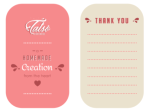
Client Challenge: Mahlatse Lentsoane, founder of Tatso homemade, approached us to assist her with creating a logo and CI collateral which reflects her brand of yummy homemade dairy products, mainly ice-cream.
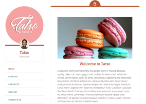
Tatso logo on the website
Our Solution: We created a typographic logo inspired by the splashing movement of milk when it is poured into a glass. We wanted it to look delicious.
- Illustration
- Typography design
- Logo Design
- Branding
- Identity Design
Meghaa’s approach
The logo had to look tasty. This was my starting point. The stylised typography was inspired by milk because this is the primary ingredient of the product. The custom cursive serifs are referenced from milk splashes. The splashes were also inspiration to create an animated email signature of the milk splashing. The pink secondary colour was requested by client. A minimal layout design complements the subtle details on the logo design.
Client Love
Thank you for assisting with a logo design that resonates with the type of product or service we produce.
It verbalises authentic homemade treats made with love and passion. Mahlatse Lentsoane
Illustration / Content Design
Jun 9, 2018 | |
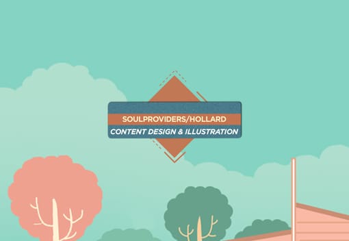
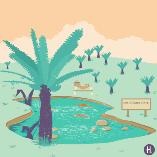
SoulProviders Collective/Hollard
Client Challenge: We were tasked with illustrating content for Hollard’s Hollardays campaign.
Our Solution: We created the proposal based on the the style/mood of the festive season, while incorporating a fresh and futuristic approach on all visuals.
- Illustration
- Presentation Design
- Layout
Dave’s approach
We wanted to bring out iconic elements from each place that we were bringing to life, that would at once tell a story about a destination or experience but also give it a unique moment in the series.