Current category or tag:

Mail & Guardian 200 Young South Africans

Mail & Guardian 200 Young South Africans

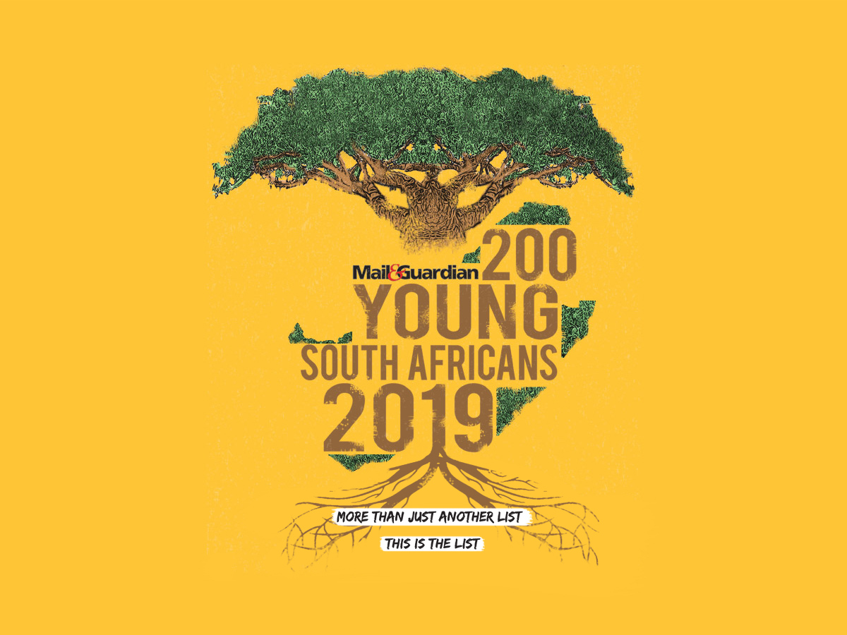
Illustrated Cover Design

Mail & Guardian 200 Young South Africans

Cover Design and Digital Content Design

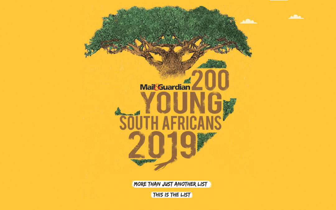
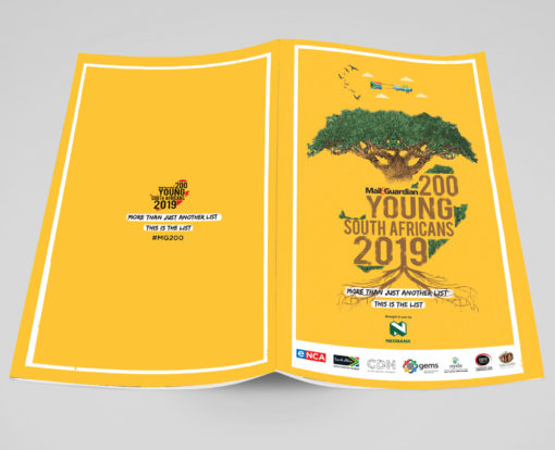
Client Challenge: Coming up with a cover design that encapsulates the spirit of the chosen 200 young South Africans.

Our Solution: We used the Baobab tree as the central figure for the design. As a giver of life and an important part of natures eco-system, it represents growth and patience

  • Illustration
  • Graphic Design

Dave’s approach

As an alumini of the 2015 list, I was tasked with creating something that slightly leans towards my signature style. I kept it clean, keeping Mail and Guardian’s  audiencein mind.
Stogie T: Honey & Pain

Stogie T: Honey & Pain

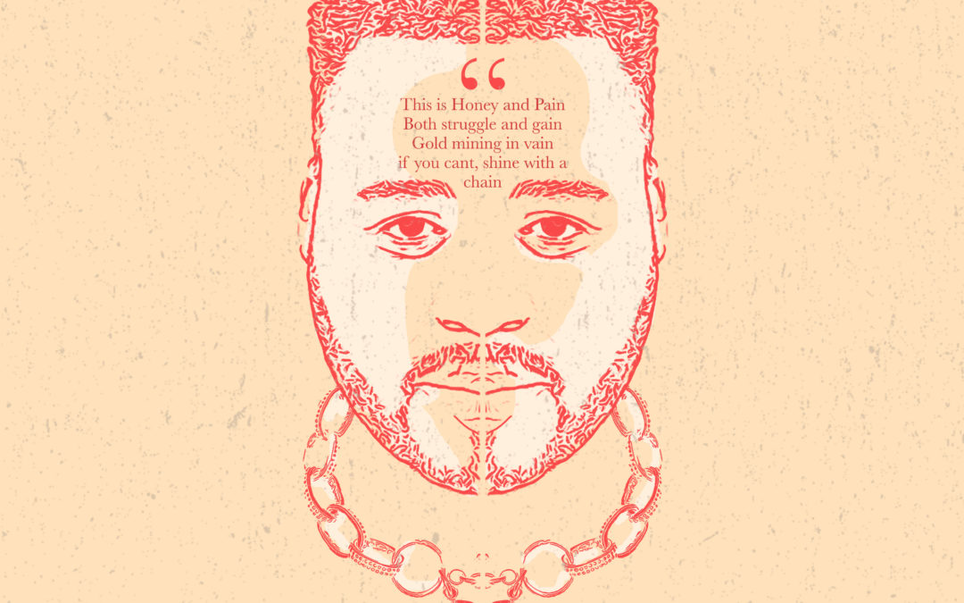
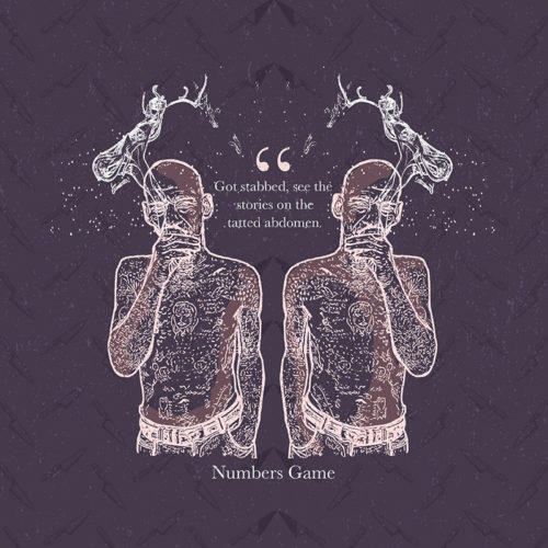
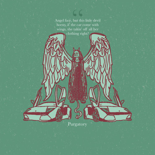
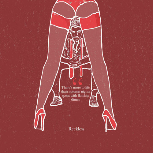
Music Artwork Design

Stogie T: Honey&Pain

Poster Design

Client Challenge: Coming up with music artwork that accompanies the music on Stogie T’s mixtape

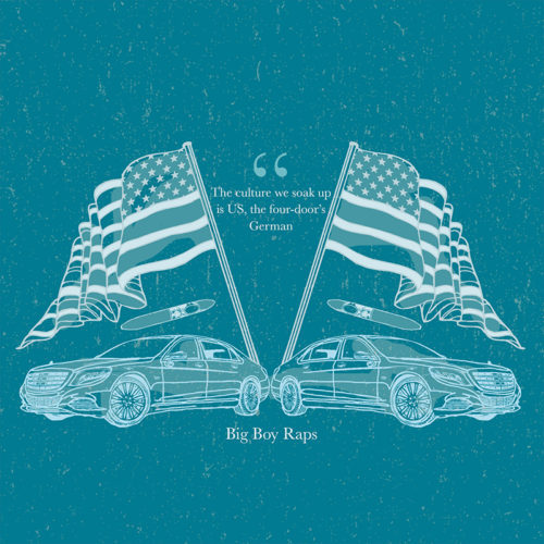
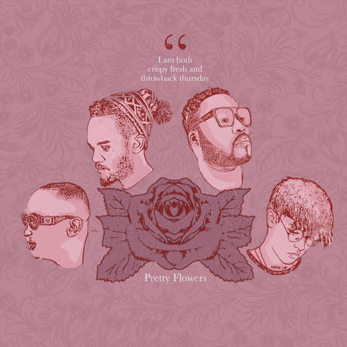
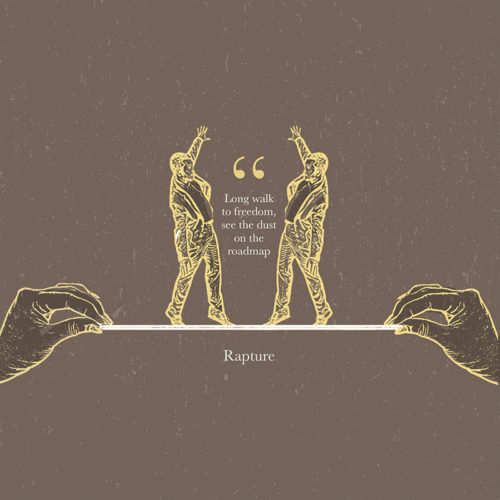
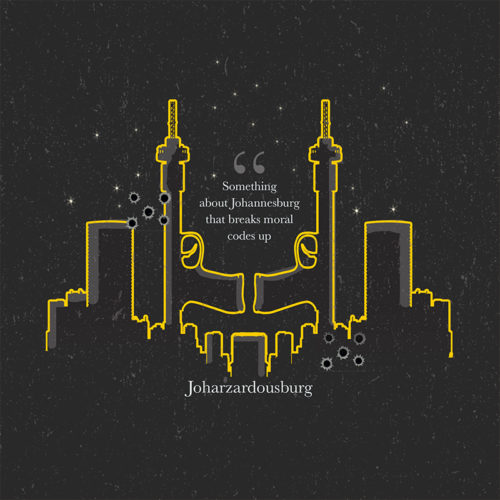
Our Solution: Keeping in line with the theme of the Title track; “Honey & Pain,” we visually explored his theme of duality. We used symmetry in design and strong contrasts between dark and light colours in our pallete. All visual elements were referenced from the lyrics in the respective songs on the mixtape.


  • Illustration
  • Graphic Design
  • Corporate Identity Design

Dave’s approach

I kept the colours more muted, in contrast to my usual bright style. I tried to be more conceptual and maintain Stogie T’s intergrity visually.

Cheri Yase Kasi / Paraka

Cheri Yase Kasi / Paraka

Poster Design

Cheri Yase Kasi/ Paraka

Poster Design

Client Challenge: Coming up with a poster design that speaks to a more mature, but young hip market.

Our Solution: We used vibrant colours, a subtle, patterned background and contrasted black&white photography to have an energetic poster that resonates with the targeted consumers

  • Illustration
  • Graphic Design
  • Corporate Identity Design

Lerato’s approach

I played around with lots of colours and tried to have a cool contrasting effect with the black&white photography

Story Content Agency

Story Content Agency

Corporate Identity Design

Story Content Agency

Corporate Identity Design

Client Challenge: Coming up with an identity for a very fluid and agile new disruptive content agency that doesn’t necessarily adhere to one specific look & feel. This our 3rd project with one of our favourite clients; Takunda Bimha.

Our Solution: We came up with a flexible, multi-coloured approach, using a set number of colours that will represent the brand going forward.

  • Illustration
  • Graphic Design
  • Corporate Identity Design

Dave’s approach

I played around with lots of colours and narrowed it down to the pallete that the clients loved the most.

Clive Barker Soccer School

Strategy Design & Illustration

Clive Barker Soccer School


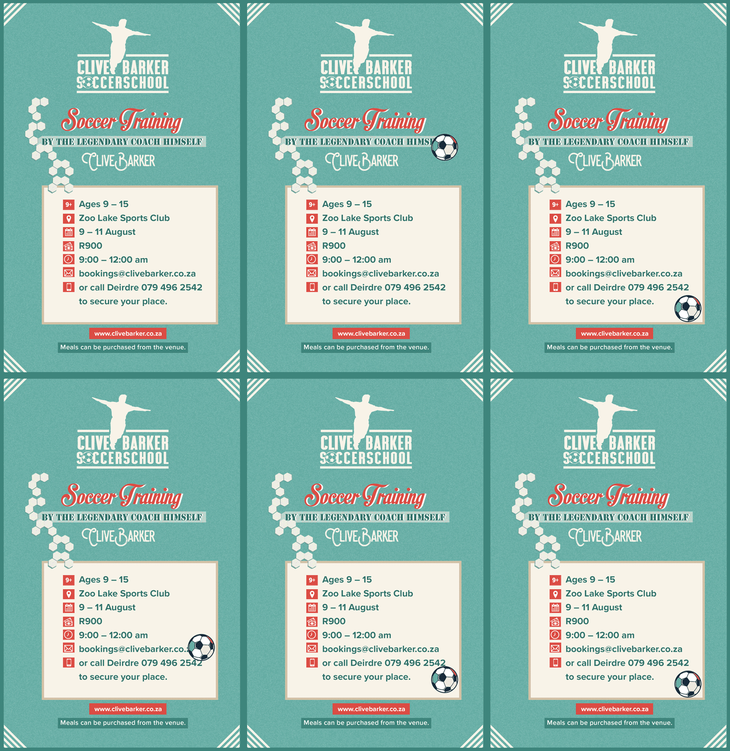
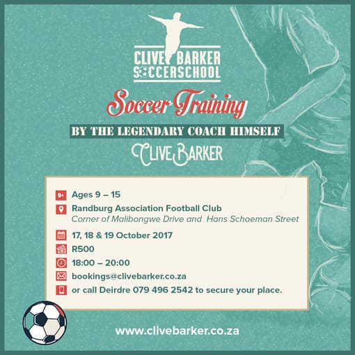
Client Challenge: We were tasked with creating an emailer for Clive Barker’s Soccer School which caters for girls and boys, coached by the legend himself.

Our Solution: We referenced his iconic “aeroplane” celebration and made this into a silhouette as an anchor for the logo design.

  • Logo Design
  • Brading

Dave’s approach

I looked for an icon that was immediately recognizable, I thought that Clive Barkers silhouette works in this regard.