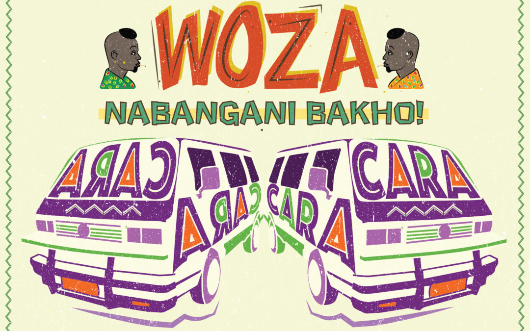
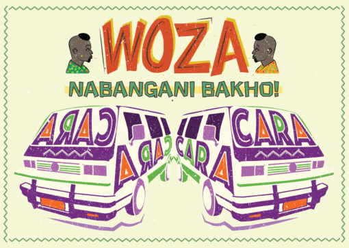
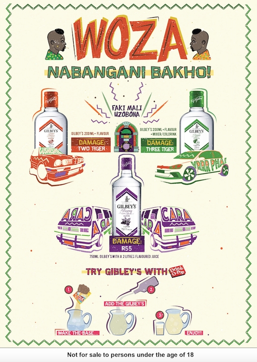
Client Challenge: Our challenge was to help our client, Libra Productions, with their campaign to explore and encourage new township drinking rituals for a DiegoSA mainstream spirit, Gilbey’s. We assisted them by designing point-of-sale collaterol that delivers on the message of a mixability drinking ritual at an affordable price. We were charged with ensuring that the message was communicated in a language/style that is native to the market, we applied our minds to the copy-writing, design and layout of the posters.
Our Solution: Working closely with our client, who wanted the work to draw deeply from the real world insight of the sharing culture ukugazatha, we co-created the poster campaign that advertised some ‘combos’ named after township names for popular cars. The aim was for the artwork to connect with consumers and spark conversation, encouraging consumers to enquire about and trial the product.
Illustration
Copywriting
Graphic Design
Poster Design
Dave’s approach
Drawing on references of township small business hand-drawn signage, I layered together illustrated elements like the vehicles with custom typography, making the “kasi lingo” pop. We wanted the posters to pique the consumers curiosity in taverns, driving them to ask for more information on the combo products advertised. We really enjoyed the co-creation with our client and drawing on our cultural intelligence and applying our copywriting skills to the task at hand.
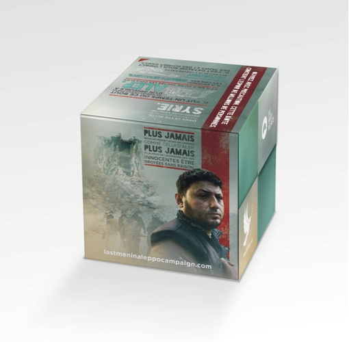
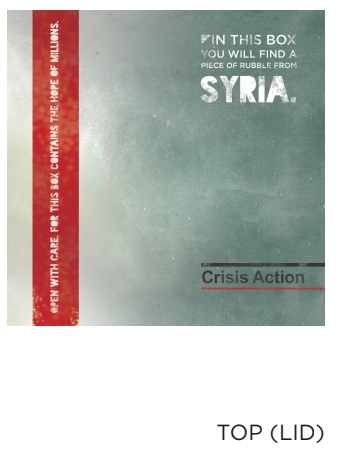
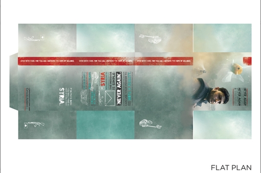
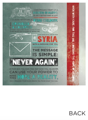
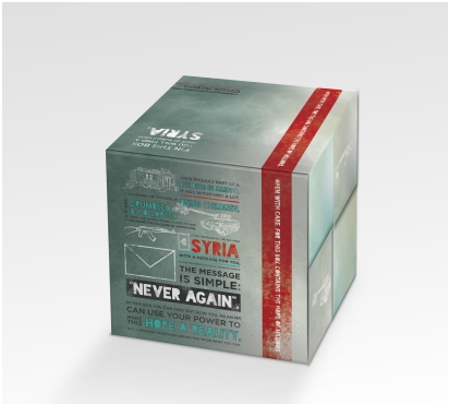
Client Challenge:Crisis Action is a non-profit organisation that aims to protect civilians from armed conflict. Following on from the 2017 Annual Report that we designed, we were commissioned to design a gift box for the organisation to send their annual report to their stakeholders and supporters.
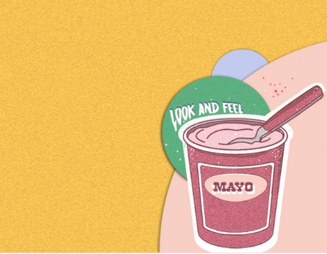
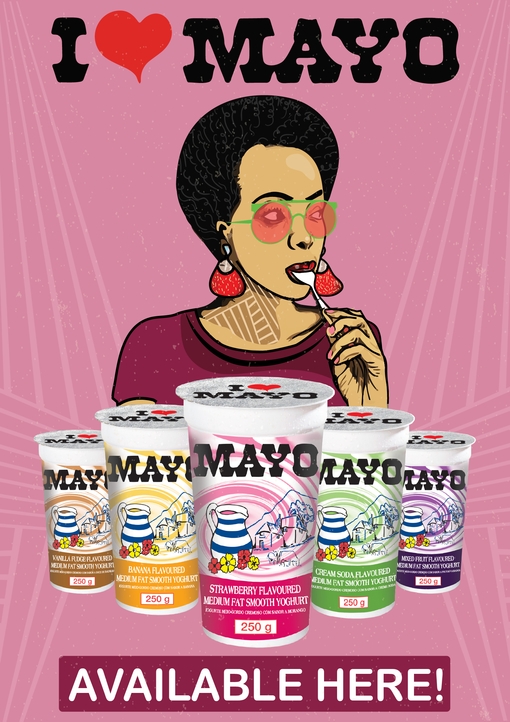
Client Challenge: Africa Expansion/Danone is a global food company holding top positions in healthy food through its four businesses Fresh Dairy Products, Early Life Nutrition, Waters, and Medical Nutrition. The company approached Suketchi to assist with branding and to bring one of their products Mayo to life by designing elements for point of sale.
Our Solution: To illustrate how tasty Mayo is, we developed a character that is enjoying the yoghurt snack with the emphasis on her licking the spoon.
Illustration
POS Design
Dave’s approach
I created a character that is synonymous with the target market. She’s cool and hip and enjoying the product
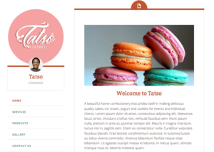
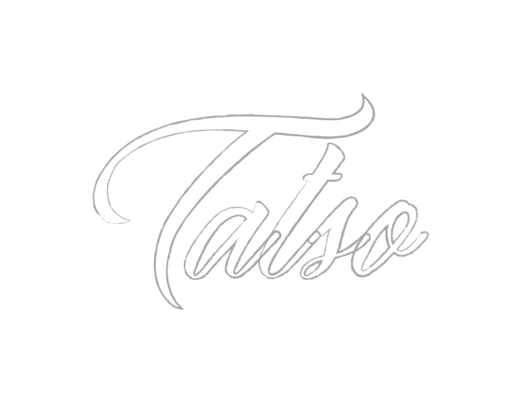
Client Challenge: Mahlatse Lentsoane, founder of Tatso homemade, approached us to assist her with creating a logo and CI collateral which reflects her brand of yummy homemade dairy products, mainly ice-cream.
Tatso logo on the website
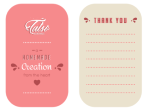
Our Solution: We created a typographic logo inspired by the splashing movement of milk when it is poured into a glass. We wanted it to look delicious.
Illustration
Typography design
Logo Design
Branding
Identity Design
Meghaa’s approach
The logo had to look tasty. This was my starting point. The stylised typography was inspired by milk because this is the primary ingredient of the product. The custom cursive serifs are referenced from milk splashes. The splashes were also inspiration to create an animated email signature of the milk splashing. The pink secondary colour was requested by client. A minimal layout design complements the subtle details on the logo design.
Client Love
Thank you for assisting with a logo design that resonates with the type of product or service we produce.
It verbalises authentic homemade treats made with love and passion. Mahlatse Lentsoane
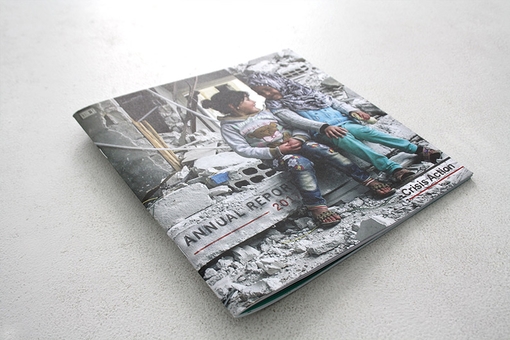
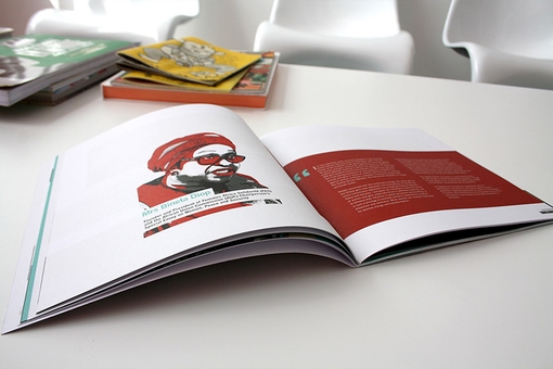
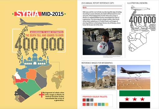
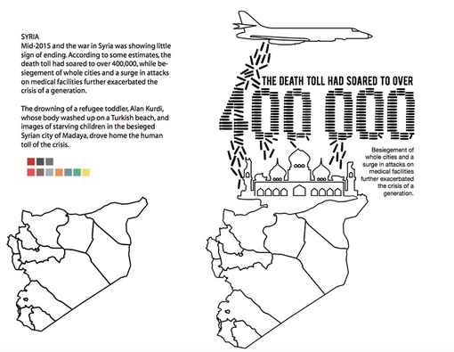
Client Challenge:Crisis Action is a non-profit organisation that aims to protect civilians from armed conflict. The team approached us to create their 2017 annual report to shed light on their work, using our distinct visual approach, while respecting the sensitive subject matter.
Suketchi-Branding-and-Design-Crisis-Action-06
Double page spread from the 2017 Annual Report
Our Solution: In order to fulfill the requirements of the brief, we identified three main visual directions to effectively communicate Crisis Action’s work:
Photography
Illustration
Data Visualisation
Quotation from David:
We benchmarked our approach against other annual reports and noticed that for ours to be unique, we needed to seamlessly integrate crafted graphs, iconography and illustrations to sit nicely and juxtapose with the existing emotive photography.