Current category or tag: Copy Writing Copy Editing

Libra/Diageo – Gilbey’s

Libra/Diageo – Gilbey’s

Copywriting & Poster Design

Poster Design

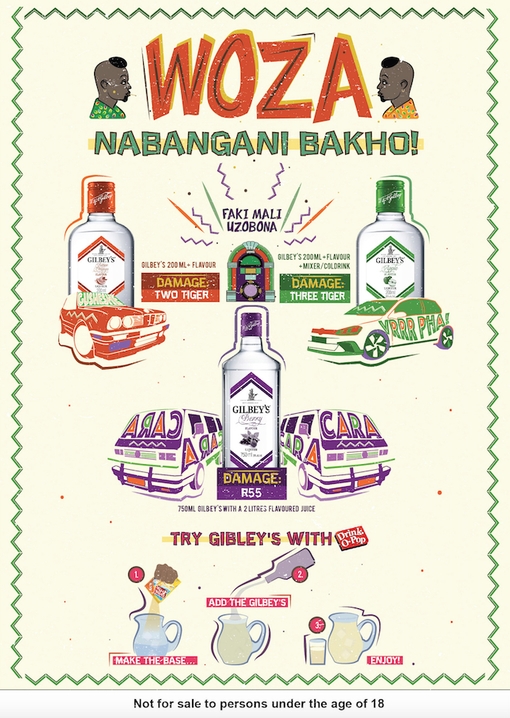
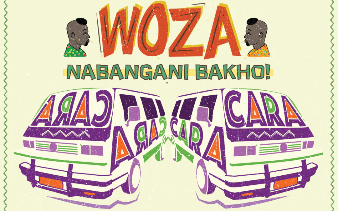
Gilbey’s Township Combos

Client Challenge: Our challenge was to help our client, Libra Productions, with their campaign to explore and encourage new township drinking rituals for a DiegoSA mainstream spirit, Gilbey’s. We assisted them by designing point-of-sale collaterol that delivers on the message of a mixability drinking ritual at an affordable price. We were charged with ensuring that the message was communicated in a language/style that is native to the market, we applied our minds to the copy-writing, design and layout of the posters.

Poster design Libra SUketchi Prices CaraCara

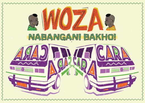
Our Solution: Working closely with our client, who wanted the work to draw deeply from the real world insight of the sharing culture ukugazatha, we co-created the poster campaign that advertised some ‘combos’ named after township names for popular cars. The aim was for the artwork to connect with consumers and spark conversation, encouraging consumers to enquire about and trial the product.

  • Illustration
  • Copywriting
  • Graphic Design
  • Poster Design

Dave’s approach

Drawing on references of township small business hand-drawn signage, I layered together illustrated elements like the vehicles with custom typography, making the “kasi lingo” pop. We wanted the posters to pique the consumers curiosity in taverns, driving them to ask for more information on the combo products advertised. We really enjoyed the co-creation with our client and drawing on our cultural intelligence and applying our copywriting skills to the task at hand.

German Embassy

German Embassy

Logo Design

KhombiSA

Slogan Co-creation & Logo Design

Client Challenge: To co-create a slogan and icon for the German Embassy’s Combi with an unexpected South African approach that doesn’t isolate the youth but instead intrigues them. The German Information Centre revamped an ‘old school’ VW bus which travels to different parts of South Africa to promote the German language, culture and values in a fun, friendly, modern and interesting way. The bus has a cool, funky, design inspired by the colours of the German flag (red, black and yellow). It has a sitting area in the bus to enable small scale discussions as well as speakers and a sound system in the interior. The team were looking for a logo and a slogan/catch phrase that will fit the character and feel of the bus and make people curious about finding out more about the bus.

Our Solution: After exploring different name ideas for the combi project, the client settled on Khombisa, from the isiZulu word show, which perfectly allowed us to play with the concepts of Khombi- representing the iconic and much-loved German vehicle, and -SA for South Africa.

  • Illustration
  • Logo design
  • Emblem

Dave’s approach

Keeping the youthful audience in mind that the client wanted to appeal to, I wanted to bring the three strong colours of the German flag out into a current line-drawn icon and font to catch their attention as the combi moved around locations. I wrapped the combi in the colours of the flag giving it a modern retro twist – and I coloured in the SA part of the bold typography in green to bring through the rooted South African location of the project and to play on the double entendre of KhombiSA. It was a fun project to be a part of.

Khombisa at the German Beer fest