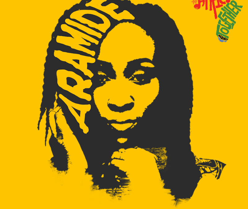
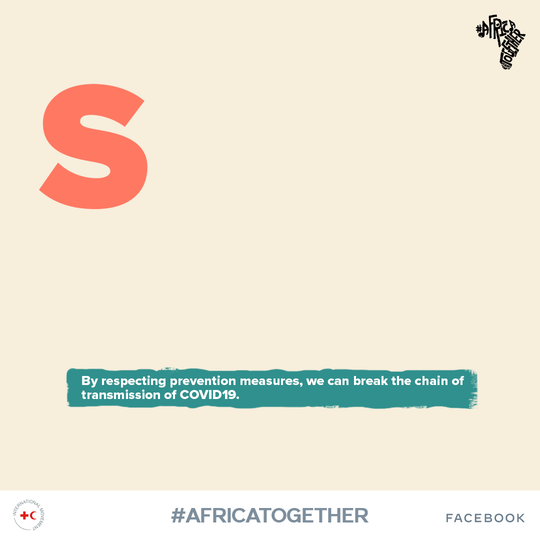
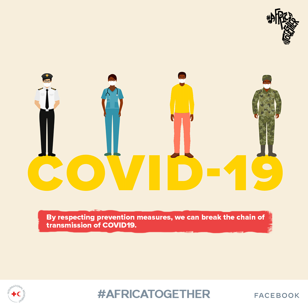
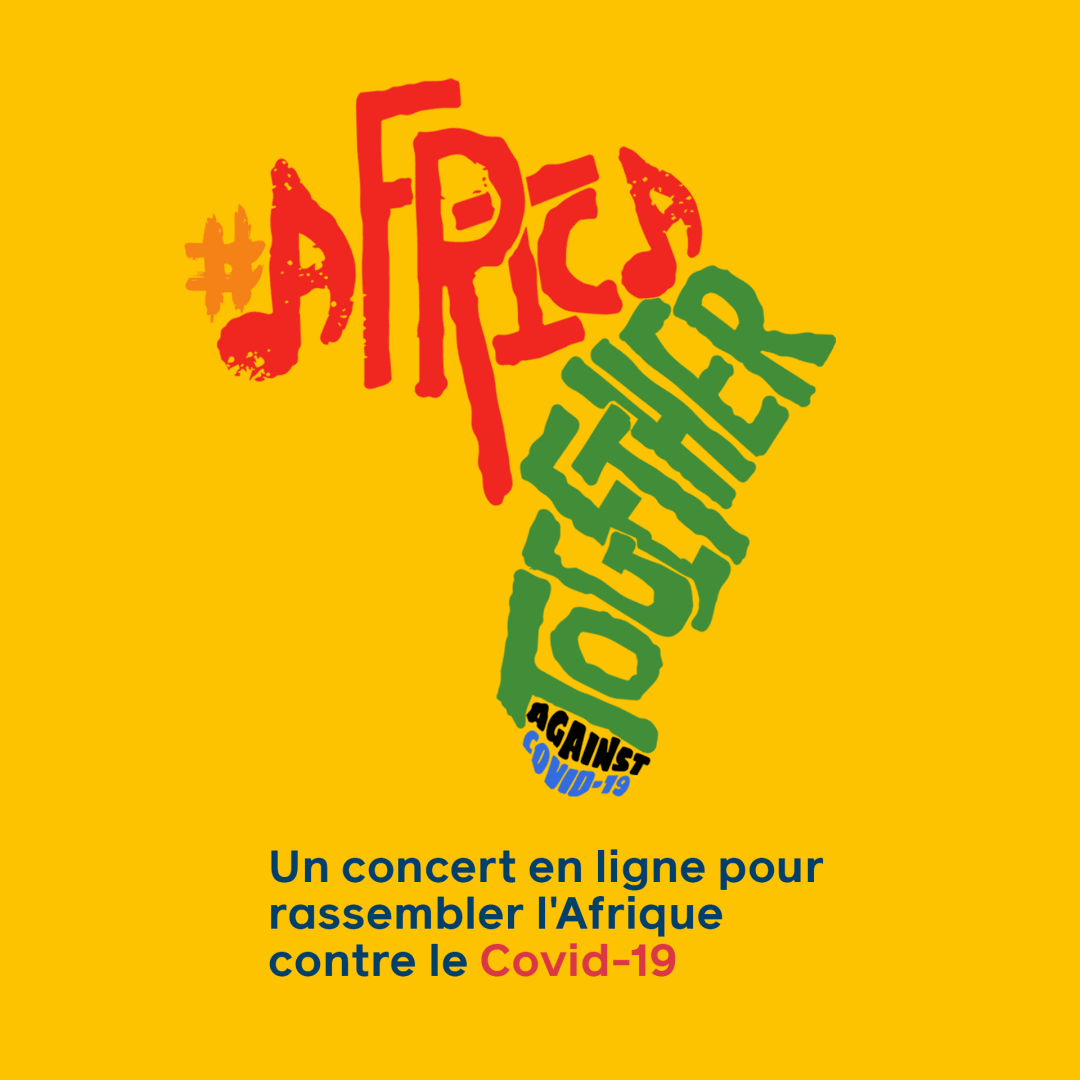
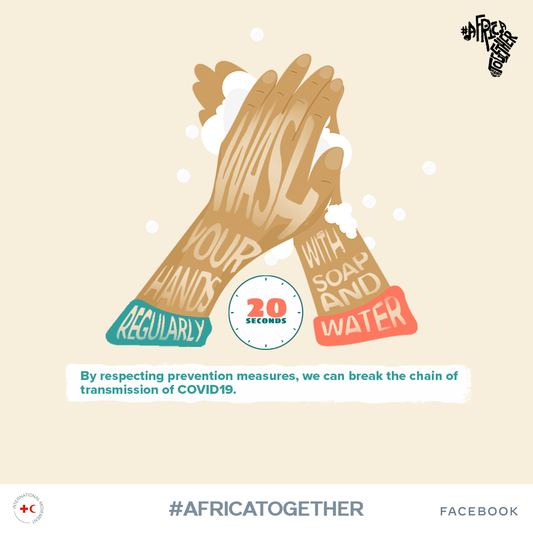
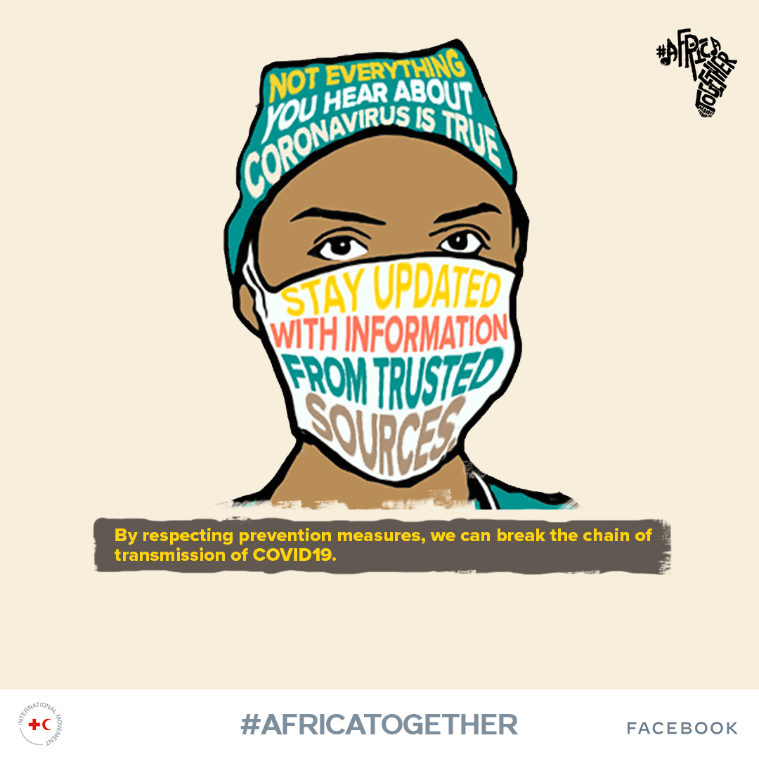
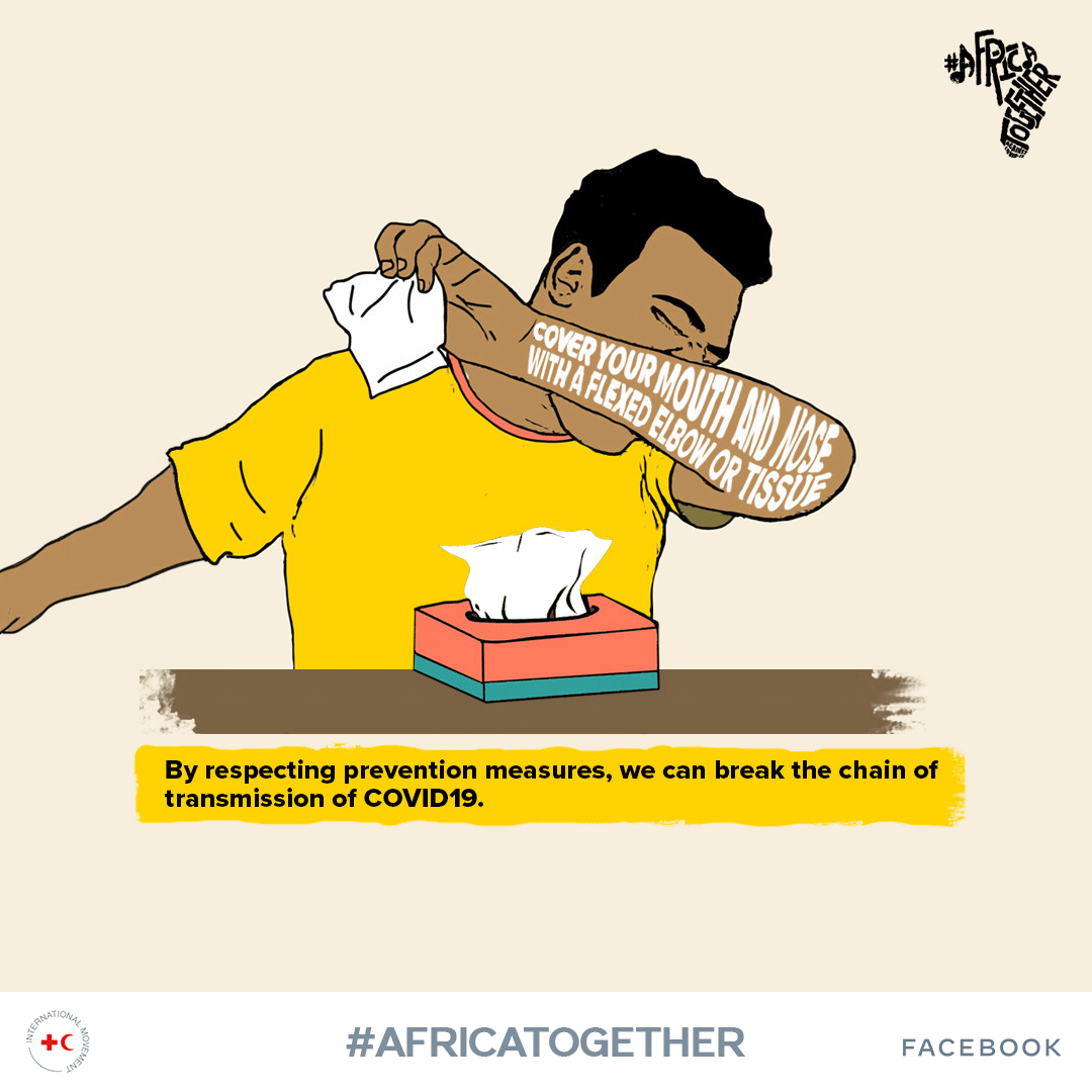
Client Challenge: We were asked to create a logo and social media identity for Facebook and the International Red Cross and Red Crescent Movement. They partnered to launch Africa Together – a digital campaign with a two-day festival on June 4th and 5th featuring artists from across Africa to fight misinformation against Covid-19 and encourage continued vigilance against the pandemic.
Our Solution: We created an authentically African logo design and colour identity that pays homage to all the nations on our continent. We also created a secondary earthy colour palette for COVID messaging info posters.
Illustration
Graphic Design
David’s approach
I used the primary colours of flags from most of the nations in Africa, namely; blue, yellow, red, green – as a reference point for the palette.
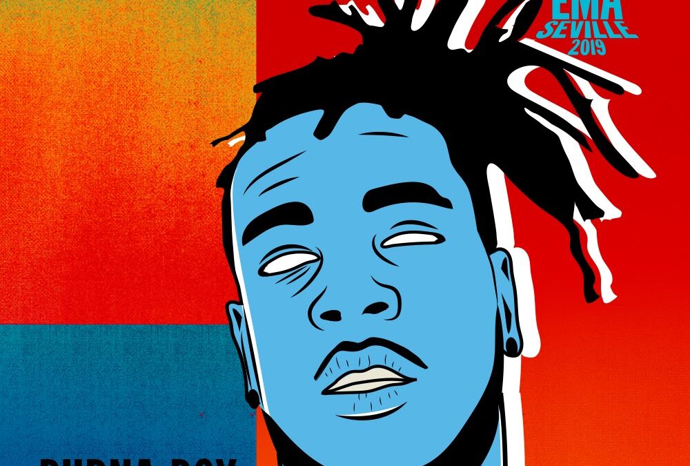
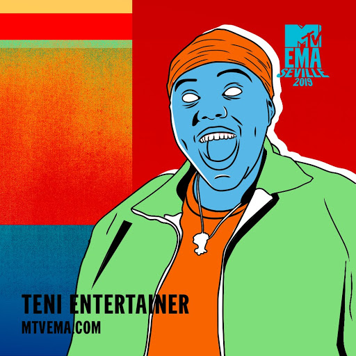
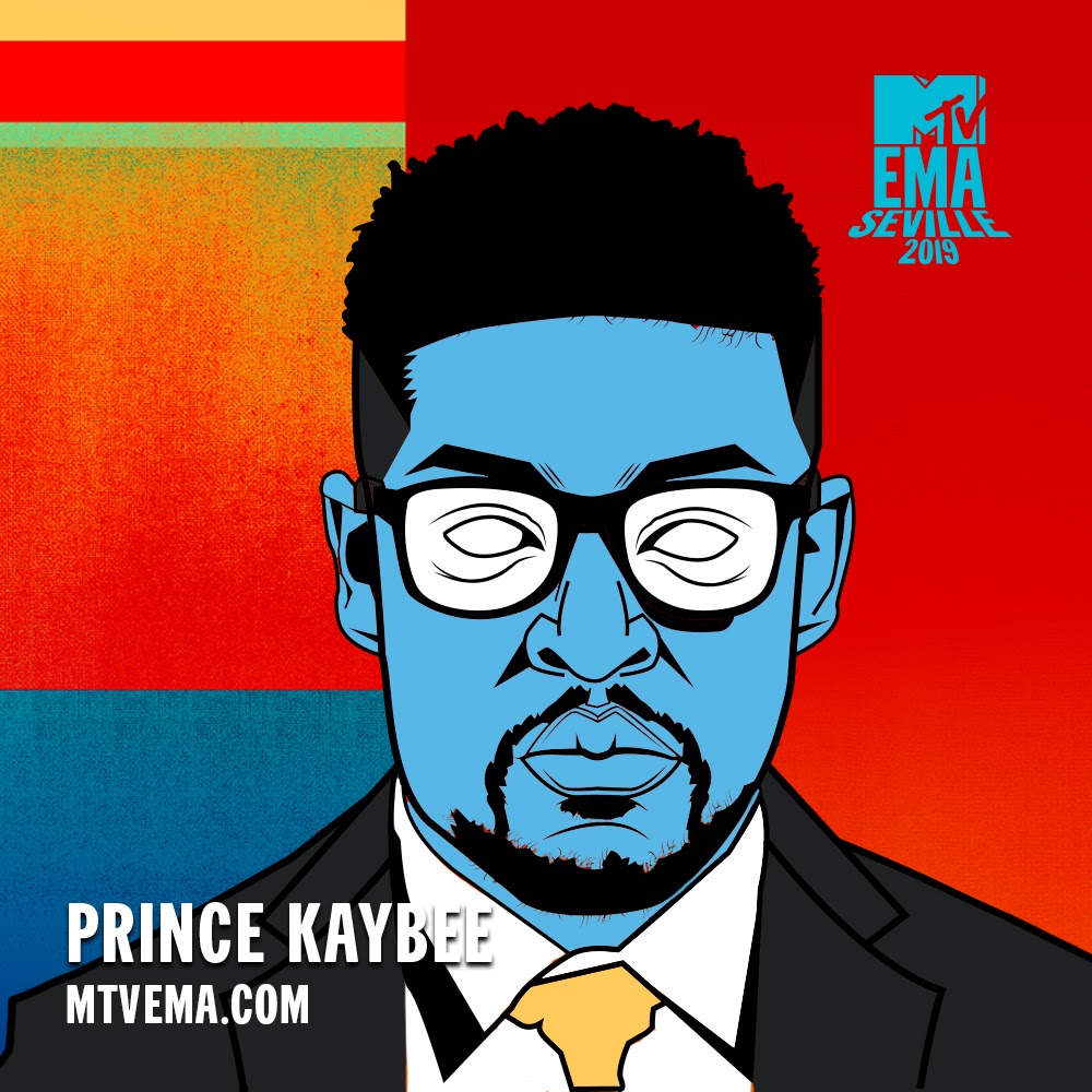
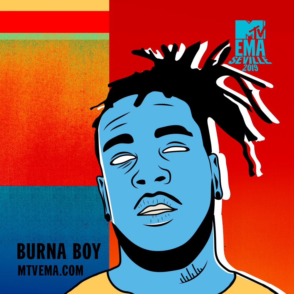
Client Challenge: We were asked to create original illustrations that celebrate and showcase the African nominees for the EMAs
Our Solution: True to form, we executed the artwork in our slick and edgy visual style that resonates with the youth, giving each a nominee a chance to shine.
Illustration
Graphic Design
David & Zwelethu’s approach
We were guided by the EMA’s existing colour pallete that we used as the foundation for our chracters illustrations, ans came up woth something very street amd edgy
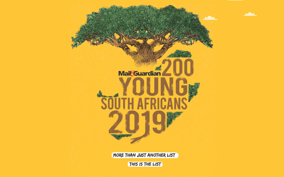
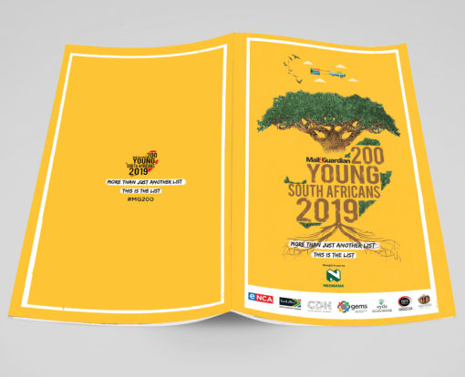
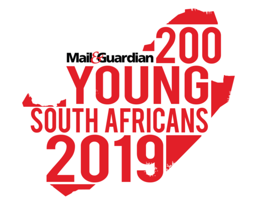
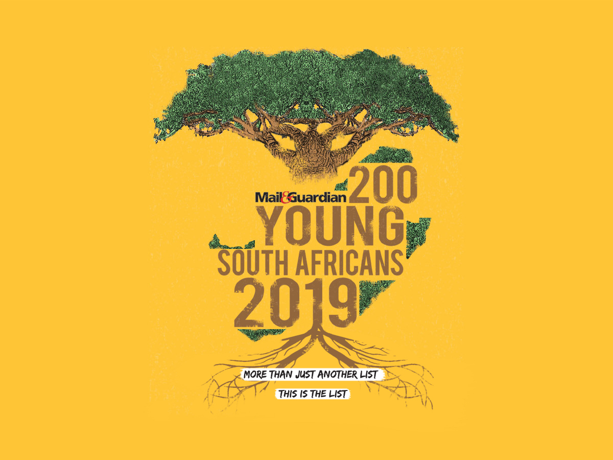
Client Challenge: Coming up with a cover design that encapsulates the spirit of the chosen 200 young South Africans.
Our Solution: We used the Baobab tree as the central figure for the design. As a giver of life and an important part of natures eco-system, it represents growth and patience
Illustration
Graphic Design
Dave’s approach
As an alumini of the 2015 list, I was tasked with creating something that slightly leans towards my signature style. I kept it clean, keeping Mail and Guardian’s audiencein mind.
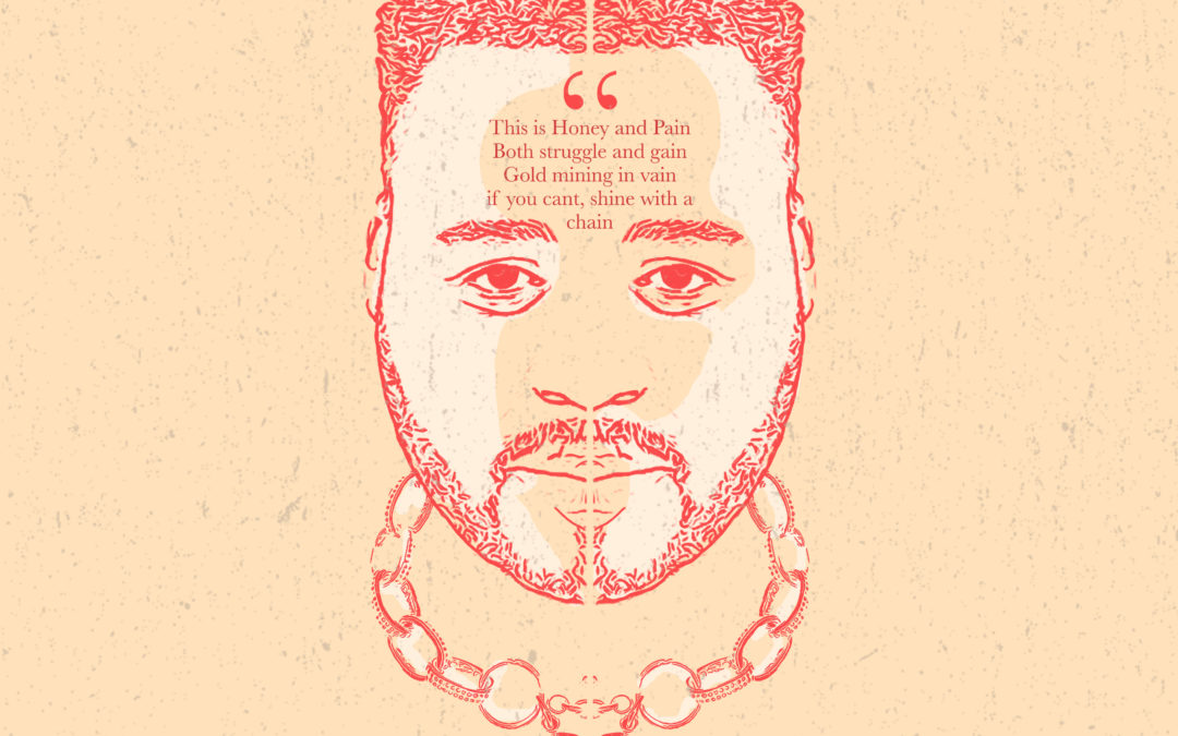
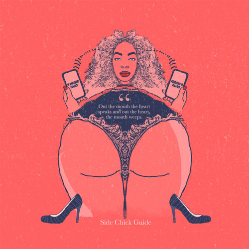
Client Challenge: Coming up with music artwork that accompanies the music on Stogie T’s mixtape
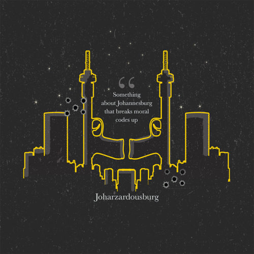
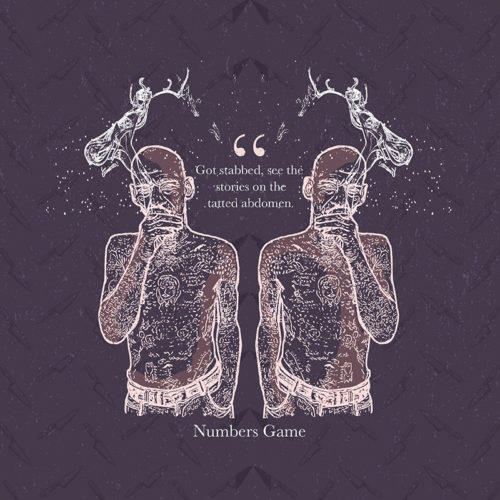
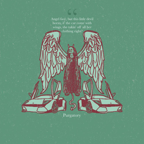
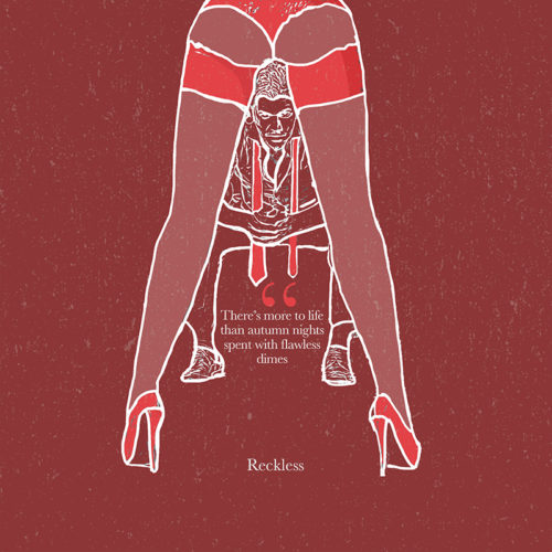
Our Solution: Keeping in line with the theme of the Title track; “Honey & Pain,” we visually explored his theme of duality. We used symmetry in design and strong contrasts between dark and light colours in our pallete. All visual elements were referenced from the lyrics in the respective songs on the mixtape.
Illustration
Graphic Design
Corporate Identity Design
Dave’s approach
I kept the colours more muted, in contrast to my usual bright style. I tried to be more conceptual and maintain Stogie T’s intergrity visually.
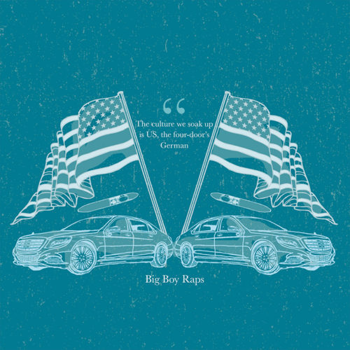
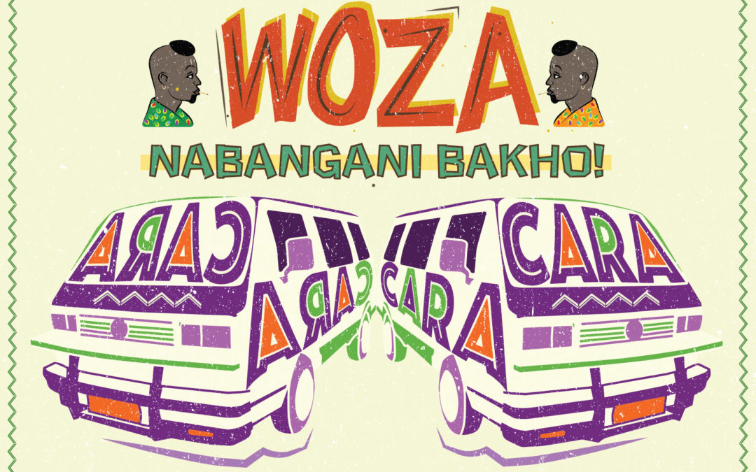
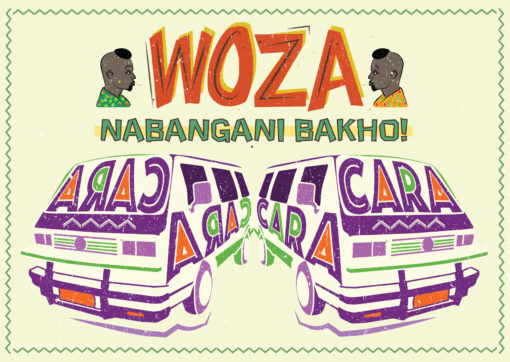
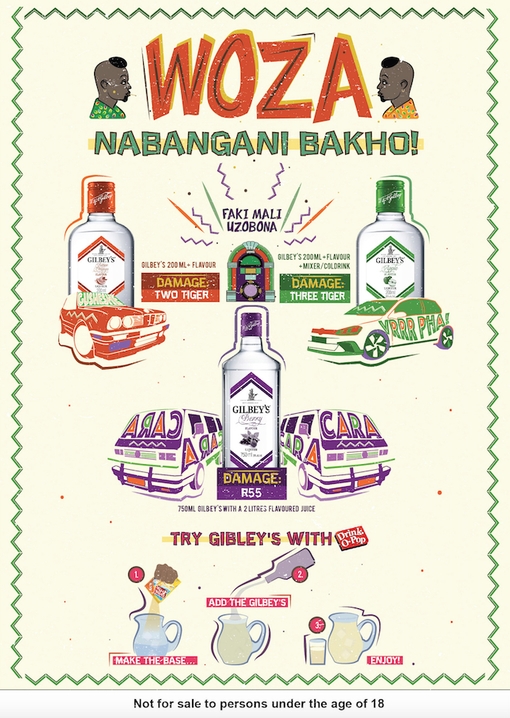
Client Challenge: Our challenge was to help our client, Libra Productions, with their campaign to explore and encourage new township drinking rituals for a DiegoSA mainstream spirit, Gilbey’s. We assisted them by designing point-of-sale collaterol that delivers on the message of a mixability drinking ritual at an affordable price. We were charged with ensuring that the message was communicated in a language/style that is native to the market, we applied our minds to the copy-writing, design and layout of the posters.
Our Solution: Working closely with our client, who wanted the work to draw deeply from the real world insight of the sharing culture ukugazatha, we co-created the poster campaign that advertised some ‘combos’ named after township names for popular cars. The aim was for the artwork to connect with consumers and spark conversation, encouraging consumers to enquire about and trial the product.
Illustration
Copywriting
Graphic Design
Poster Design
Dave’s approach
Drawing on references of township small business hand-drawn signage, I layered together illustrated elements like the vehicles with custom typography, making the “kasi lingo” pop. We wanted the posters to pique the consumers curiosity in taverns, driving them to ask for more information on the combo products advertised. We really enjoyed the co-creation with our client and drawing on our cultural intelligence and applying our copywriting skills to the task at hand.