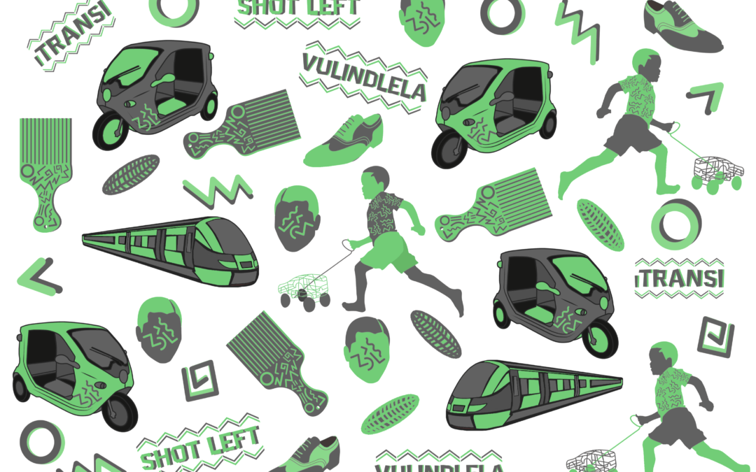
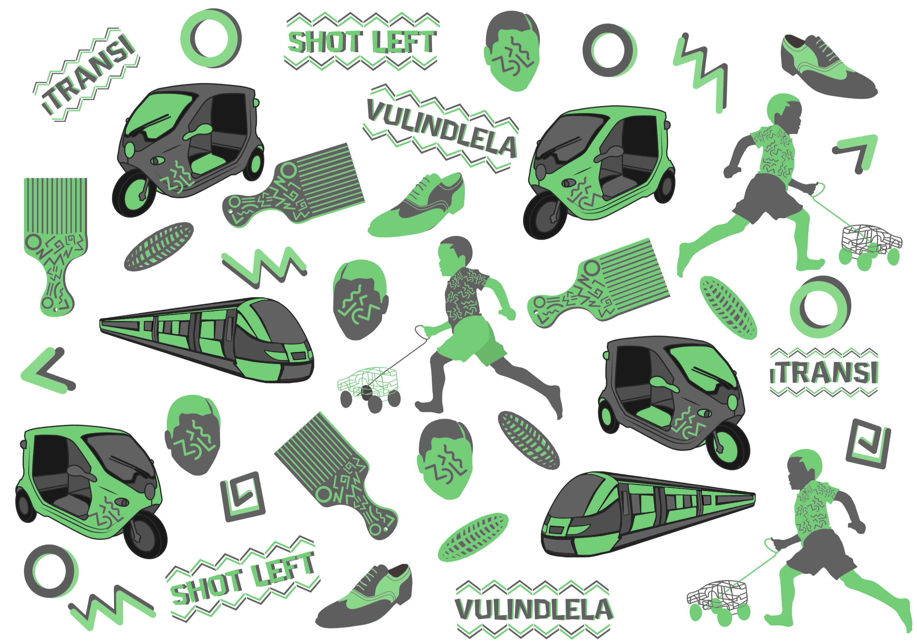
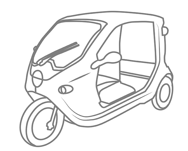
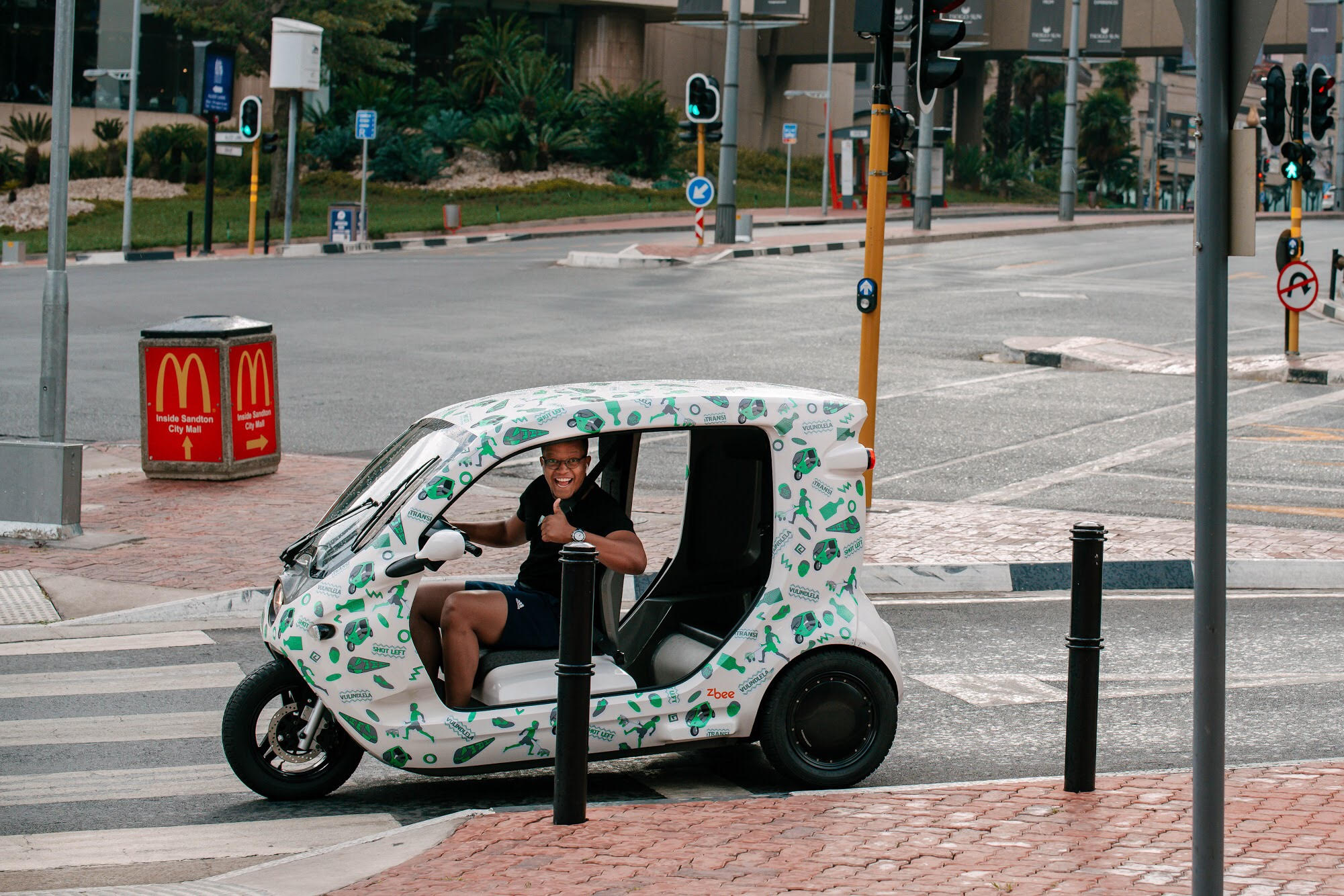
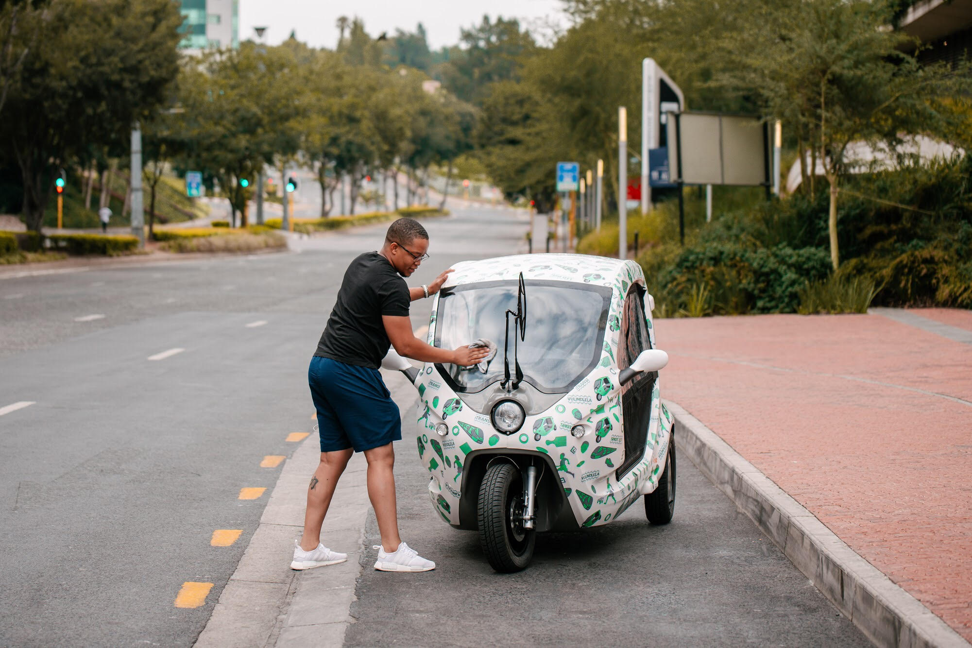
Client Challenge: Coming up with a uniquely South African pattern that also speaks to Green Scooter’s innovative approach to renewable energy and the future of transport in South Africa and Africa as a whole.
Our Solution: We have centred our creative direction around the phrase: Ukuvula Indlela – blazing a trail, carving out a path or opening up a road. This is symbolic of Greenscooter’s vision of leading this segment of transportation in South Africa.
Illustration
Graphic Design
Dave’s approach
I used iconic and distinctly South African items that have symbolism beyond their everyday, functional use.
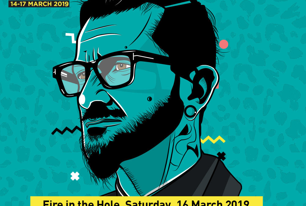
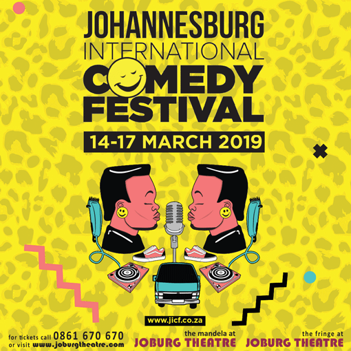
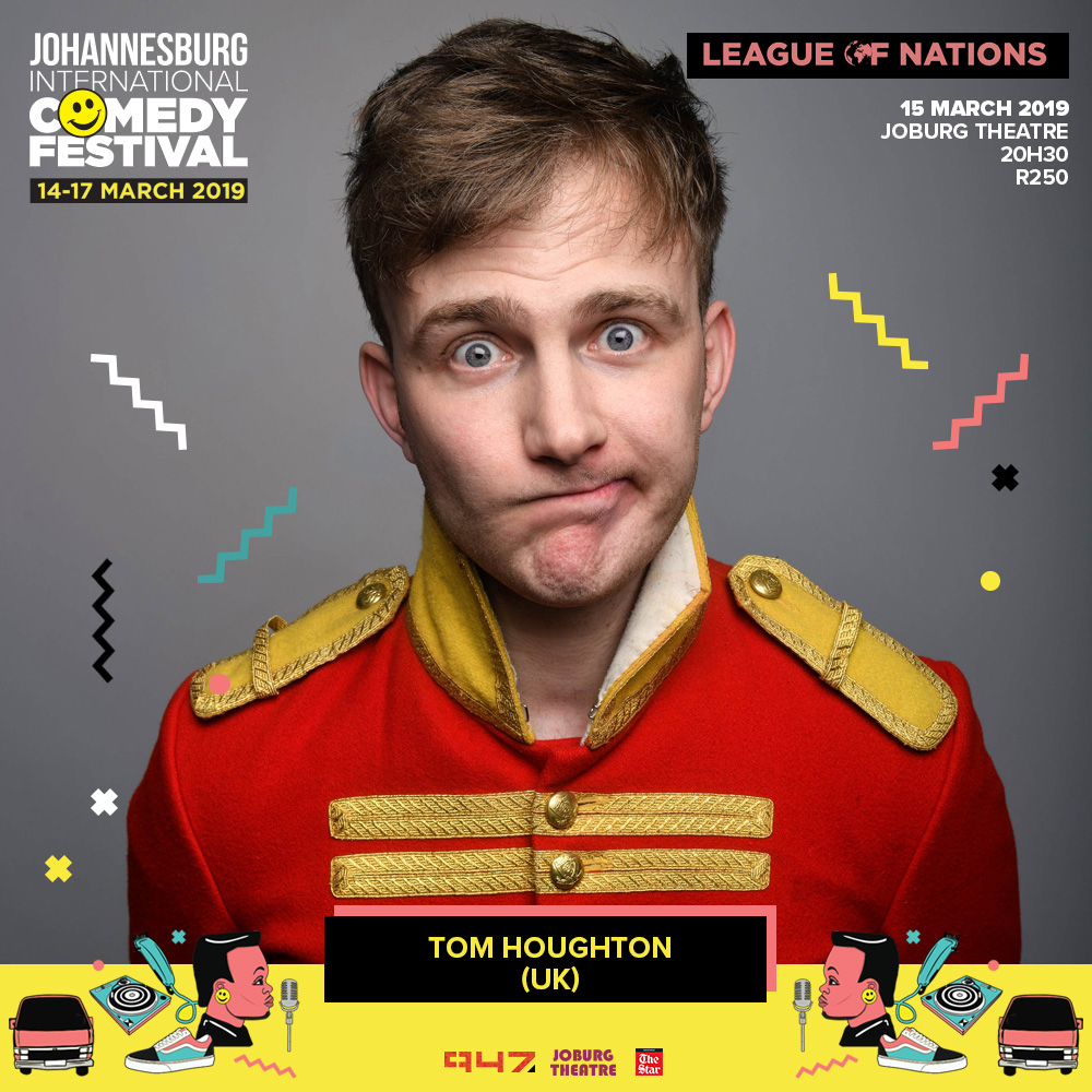
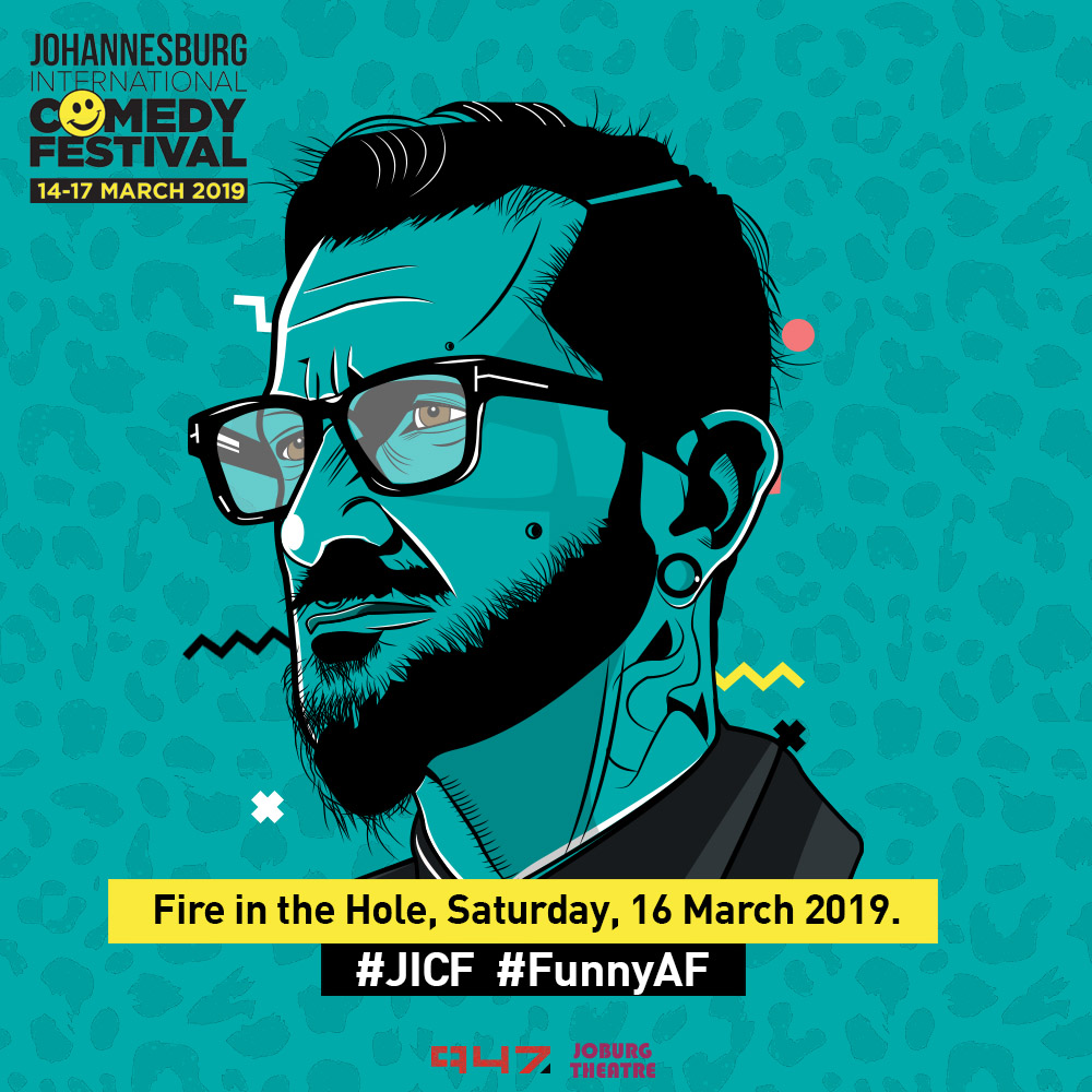
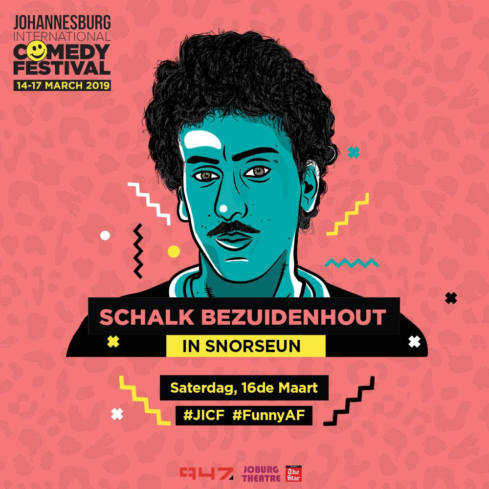
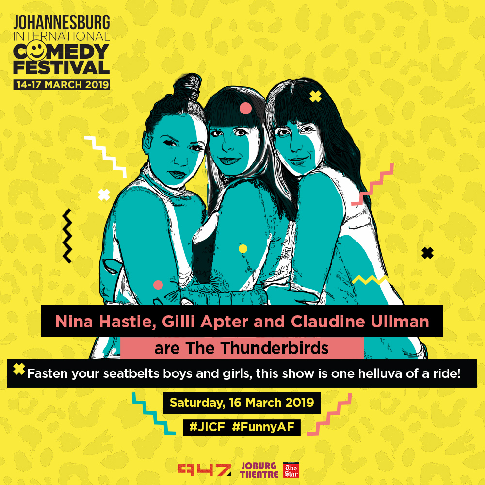
Client Challenge: We were tasked with refreshing JICF’s branding by adding crafted elements that represent Johannesburg’s metropolitan and fluid vibe.
Our Solution: We added blue and pink to JICF’s existing CI. This enabled us to re-energise the brand by adding illustration with the for-mentioned wider colour pallette.
Illustration
Graphic Design
Content Design
Dave’s approach
I added a traditional zulu pattern watermark on all collateral to form the foundation for the design.
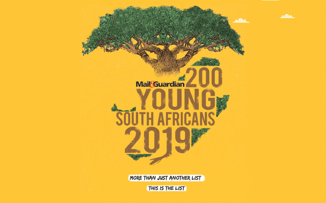
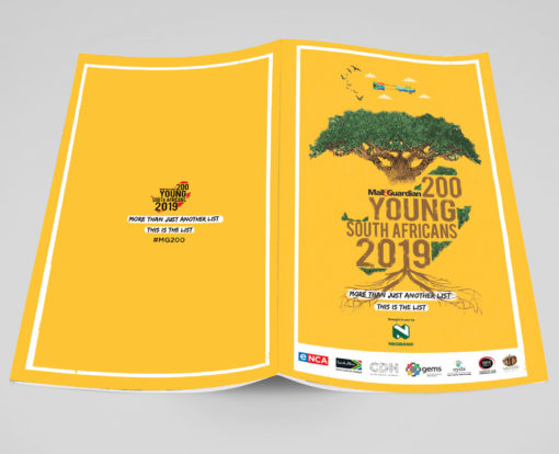
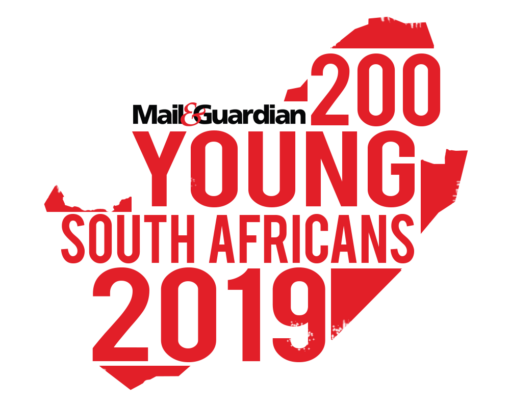
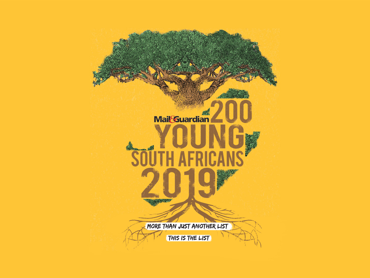
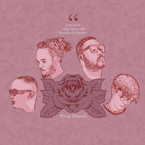
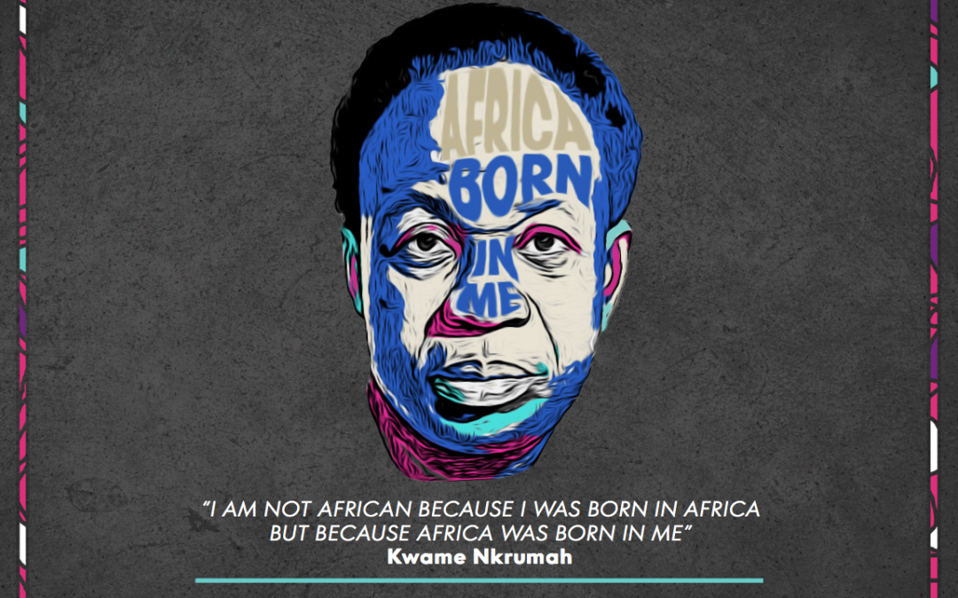
Client Challenge: Coming up with a cover design that encapsulates the spirit of the chosen 200 young South Africans.
Our Solution: We used the Baobab tree as the central figure for the design. As a giver of life and an important part of natures eco-system, it represents growth and patience
Illustration
Graphic Design
Dave’s approach
As an alumini of the 2015 list, I was tasked with creating something that slightly leans towards my signature style. I kept it clean, keeping Mail and Guardian’s audiencein mind.
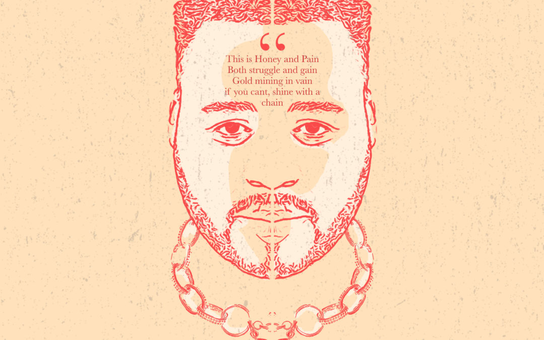
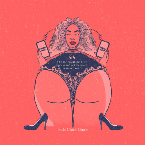
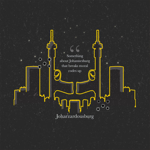
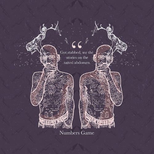
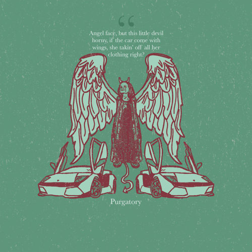
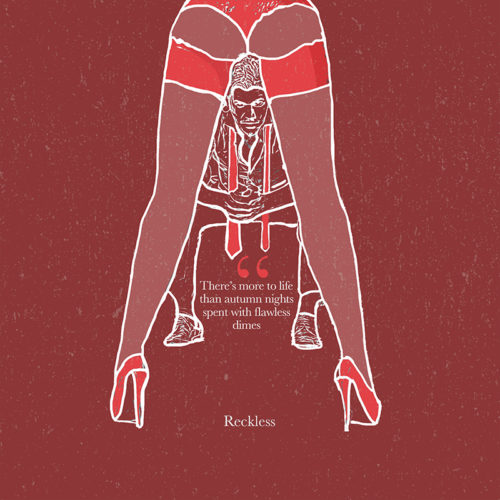
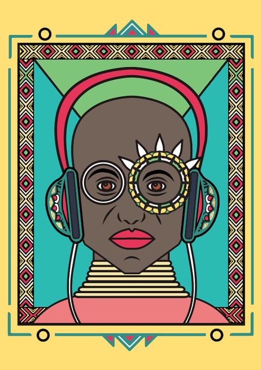
Client Challenge: Coming up with music artwork that accompanies the music on Stogie T’s mixtape
Our Solution: Keeping in line with the theme of the Title track; “Honey & Pain,” we visually explored his theme of duality. We used symmetry in design and strong contrasts between dark and light colours in our pallete. All visual elements were referenced from the lyrics in the respective songs on the mixtape.
Illustration
Graphic Design
Corporate Identity Design
Dave’s approach
I kept the colours more muted, in contrast to my usual bright style. I tried to be more conceptual and maintain Stogie T’s intergrity visually.
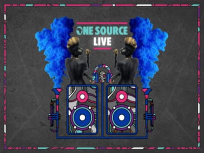
We were lucky enough to be involved in a few touchpoints at the One Source Live Festival, read about our collaboration below:
Client Challenge One:VWV Group, a global brand experience agency, required creative direction, input, design and layout for a pitch presentation for Absolut Vodka’s inaugural One Source Live Festival. Our ECD SJ was part of the brainstorming phase, while Dave designed the presentation under the direction of the one and only creative genius Takunda Bimha who headed up the winning strategic team.
Our Solution: Our team designed the layout and style of the creative pitch proposal, drawing on the highly-conceptual future-Africa theme of the One Source Live brand in South Africa, while incorporating a fresh and futuristic approach on all visuals.
Ideation
Brainstorming
Creative Direction
Presentation Design
Powerpoint Design
Illustration
Layout
Dave’s approach
The simple vector linework, coloured in-line with the Absolut’s corporate identity, had to be set against darker backgrounds like charcoal and black for it to stand out and have a bit of character, while keeping in mind the contemporary, clean but creative approach of the client’s signature approach to their visuals.
SJ’s thoughts
I love being involved in a project’s ideation phase and then seeing a team bring it to life in the way this event was organised. Takunda Bimha, Chrissy Dransfield and the VWV team paid the highest attention to detail, paying homage to the artists and creators who exhibited and performed on the day. Plus, I had such a blast at the event itself. Levels.
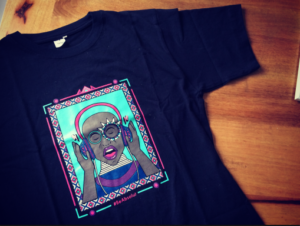
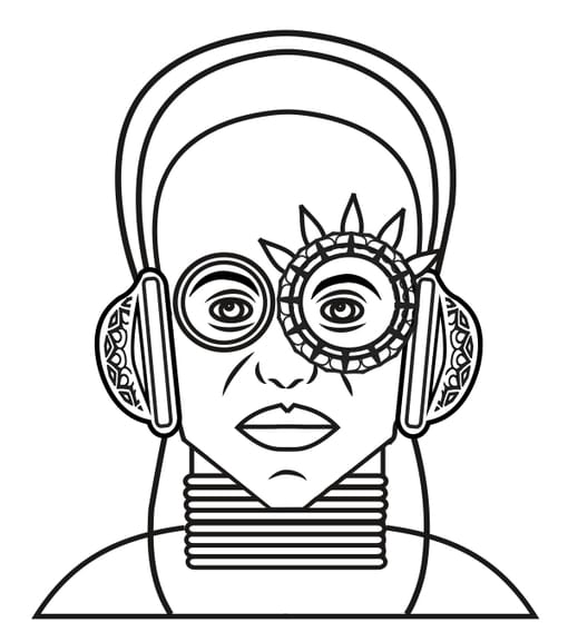
Client Challenge Two: We were asked to design an artwork for the official T-shirts at the One Source Live experience. We killed it. Thank you to Takunda and Chrissy for your belief in Team Suketchi. Cava the T!