Our Solution: Inspired by a tree that provides shelter from the sun, we created a logo that emphasises communication and a community that comes together to engage in dialogue.
Logo Design
Content Design
Dave’s approach
I created a human figure that also serves as the trunk of the tree, this emphasizes how proper human interaction serves as the backbone for building communities and growth.
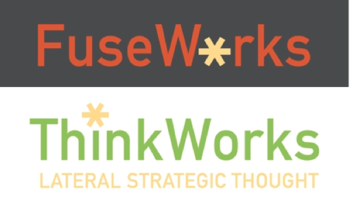
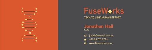
Client Challenge: We were tasked with the branding of ThinkWorks and FuseWorks, two separate but connected entities that required a co-branding approach. We needed to design a logo which captures the essence of the businesses – lateral and strategic thinking and solutions and then interpret it into email signatures.
Our Solution: Our client wanted the logo to visually represent “thinking outside the box” (for ThinkWorks) and tech solutions for strategic thinking (for FuseWorks). Both brands have a clean typographic logo with an asterisk – an asterisk represents a ‘wild card’ in coding, as directed by the client.
Logo Design
Branding
Graphic Design
Email Signature Design
Meghaa’s approach
Since the two brands are related, the flat colour palette enables us to easily show their connection, along with a flat illustration style that compliments and affirms the brand association. The client knew what he wanted, and gave me clear instructions which I was able to interpret into a polished final co-created product.
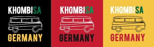
Client Challenge: To co-create a slogan and icon for the German Embassy’s Combi with an unexpected South African approach that doesn’t isolate the youth but instead intrigues them. The German Information Centre revamped an ‘old school’ VW bus which travels to different parts of South Africa to promote the German language, culture and values in a fun, friendly, modern and interesting way. The bus has a cool, funky, design inspired by the colours of the German flag (red, black and yellow). It has a sitting area in the bus to enable small scale discussions as well as speakers and a sound system in the interior. The team were looking for a logo and a slogan/catch phrase that will fit the character and feel of the bus and make people curious about finding out more about the bus.
Our Solution: After exploring different name ideas for the combi project, the client settled on Khombisa, from the isiZulu word show, which perfectly allowed us to play with the concepts of Khombi- representing the iconic and much-loved German vehicle, and -SA for South Africa.
Illustration
Logo design
Emblem
Dave’s approach
Keeping the youthful audience in mind that the client wanted to appeal to, I wanted to bring the three strong colours of the German flag out into a current line-drawn icon and font to catch their attention as the combi moved around locations. I wrapped the combi in the colours of the flag giving it a modern retro twist – and I coloured in the SA part of the bold typography in green to bring through the rooted South African location of the project and to play on the double entendre of KhombiSA. It was a fun project to be a part of.
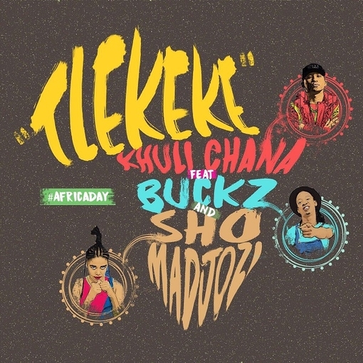
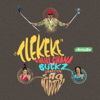
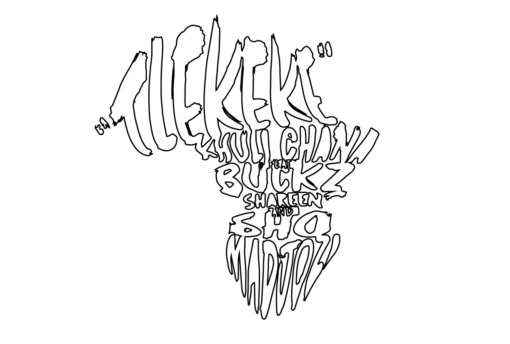
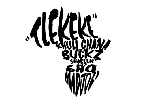
Client Challenge: Motswako rapper Khuli Chana, had a single release on Africa Day and asked us to design artwork for the single called “Tlekeke” with a very short time to turn it around. We brought it, for a fierce Motswako Originator who we are proud to call our friend and client.
Our Solution: Inspired by the African continent, we created artwork that included the featured artists on the single. It was released on Africa Day. We incorporated bold visuals and colours to be inline with the message the artists wanted to get across.
Illustration
Cover design
Single Cover Design
Music
Identity Design
Dave’s approach
The brown background represents the earth and African land. This is juxtaposed by my signature, unapologetic, bright painted typography effect that gives credence to featured artists’ own colourful and lively approach to the song.
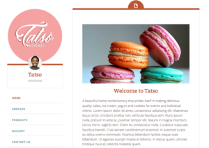
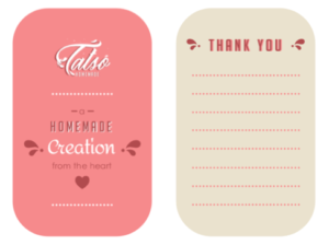
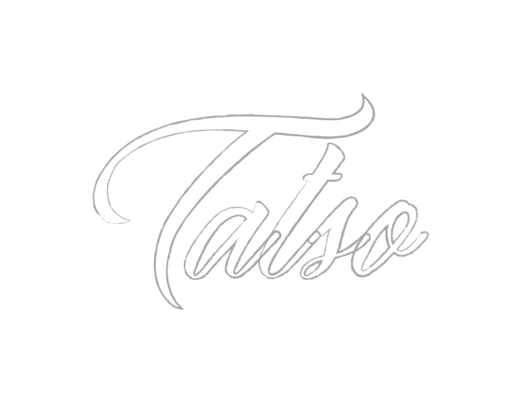
Client Challenge: Mahlatse Lentsoane, founder of Tatso homemade, approached us to assist her with creating a logo and CI collateral which reflects her brand of yummy homemade dairy products, mainly ice-cream.
Tatso logo on the website
Our Solution: We created a typographic logo inspired by the splashing movement of milk when it is poured into a glass. We wanted it to look delicious.
Illustration
Typography design
Logo Design
Branding
Identity Design
Meghaa’s approach
The logo had to look tasty. This was my starting point. The stylised typography was inspired by milk because this is the primary ingredient of the product. The custom cursive serifs are referenced from milk splashes. The splashes were also inspiration to create an animated email signature of the milk splashing. The pink secondary colour was requested by client. A minimal layout design complements the subtle details on the logo design.
Client Love
Thank you for assisting with a logo design that resonates with the type of product or service we produce.
It verbalises authentic homemade treats made with love and passion. Mahlatse Lentsoane